Case study · Website · Desktop and mobile
A front door for rural healthcare.
Anhad India's website, designed end to end: twelve templates for desktop and eleven for mobile, for a telemedicine non-profit working across rural India. Live since launch, with traffic up 40% and donations up 6%.
- Client
- Anhad IndiaKarma Healthcare Trust
- Industry
- HealthtechNon-profit · rural care
- Role
- Product DesignerWebsite, end to end
- Year
- 2024Live

- +0%
Website traffic after launch
- +0%
Donation volume after launch
- 0
Desktop templates
- 0
Mobile screens
Context
The work had outgrown its website.
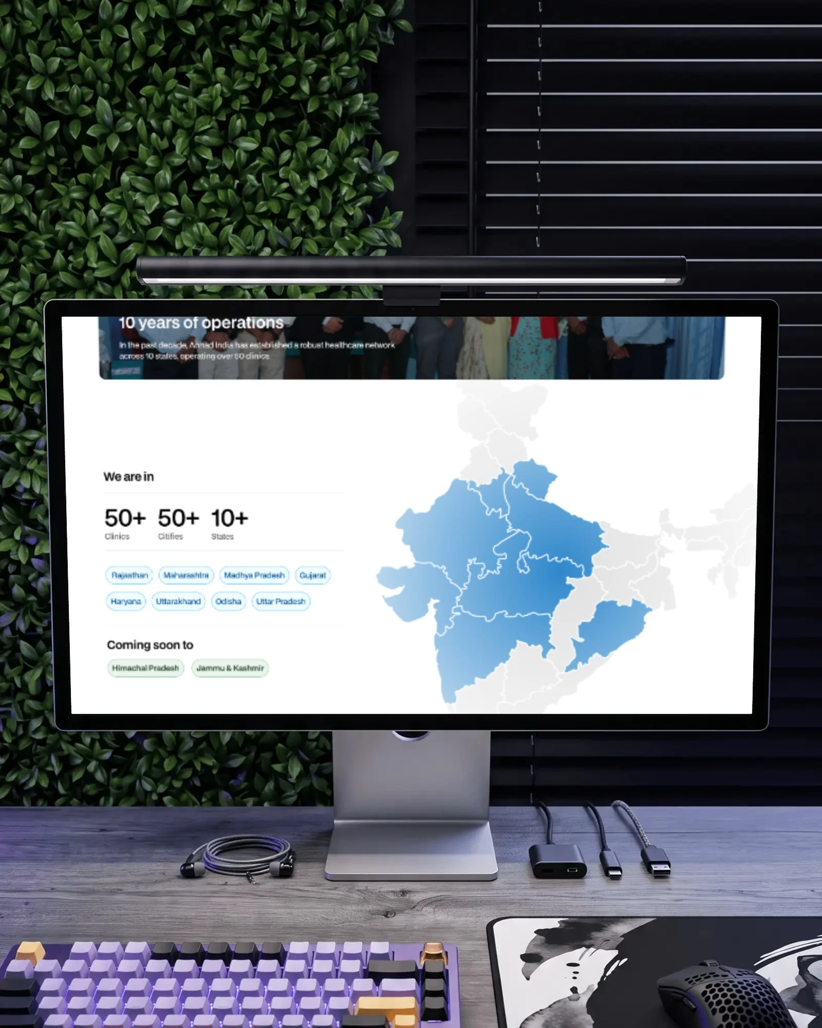
Anhad India is a non-profit that brings primary healthcare to rural communities, combining telemedicine with care on the ground. It was founded in 2014 under the Karma Healthcare Trust and now runs 50+ clinics across 50+ cities in 10+ states.
The existing website was basic, and it had fallen far behind the organisation it represented. For a non-profit, the site is where a donor decides to give, a partner decides to look closer and a volunteer decides to sign up, so it has to carry the scale of the work, the people behind it and a clear way in.
I designed the new site end to end: structure, visual language, and every template at desktop and mobile, through to launch.
The homepage
Show the gap, show the work, then make the ask.
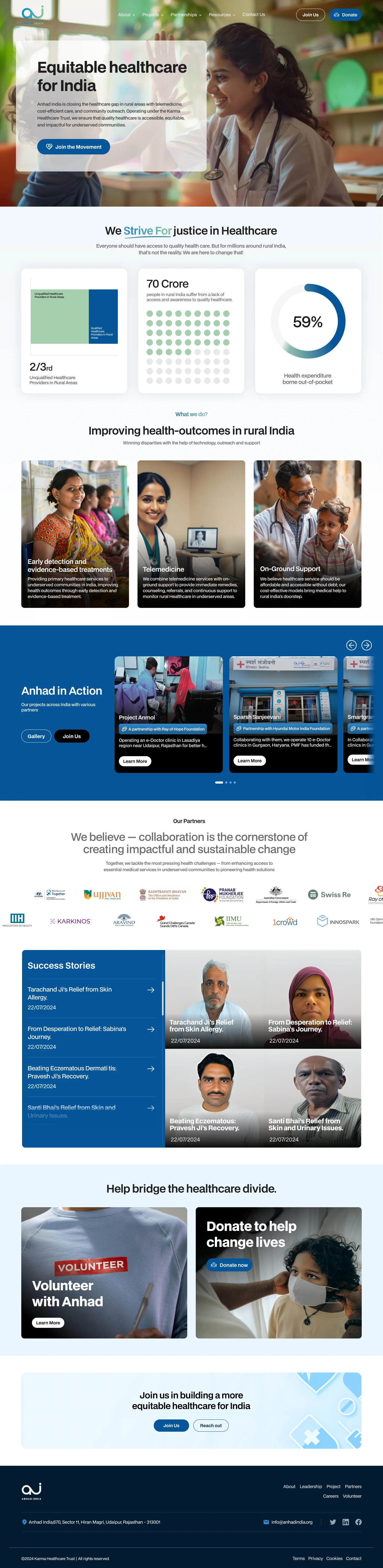
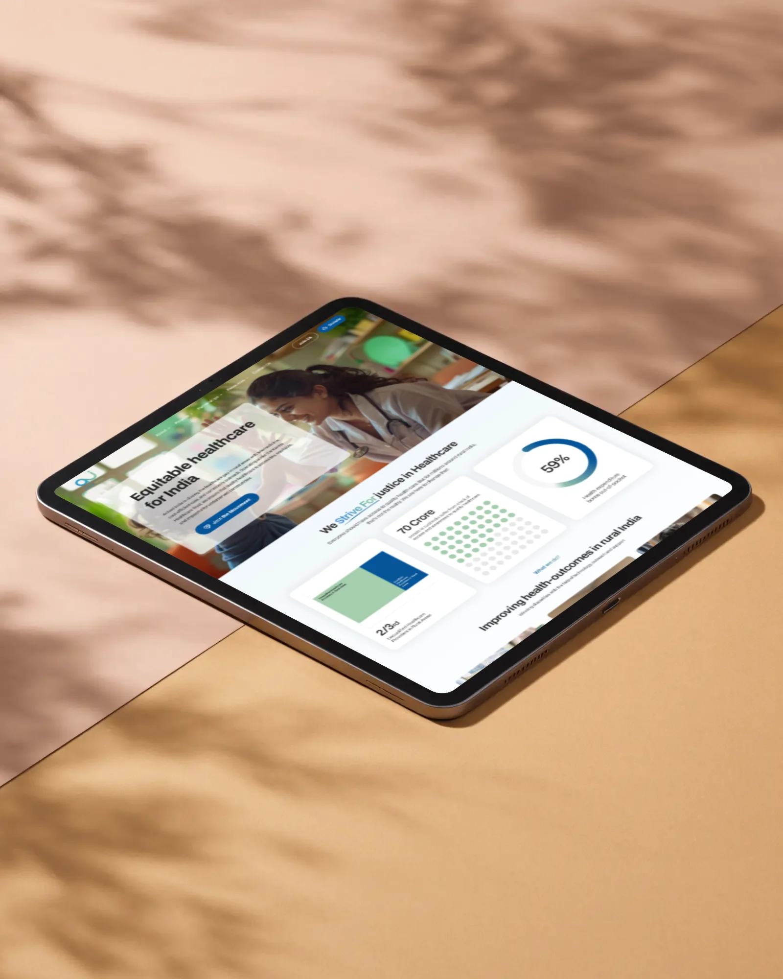
The homepage is ordered so that each section earns the next: why Anhad exists, what it does, who it works with and who it has helped, and only then the two ways to get involved. Scroll to read it the way a visitor does.
The homepage, top to bottom
One promise, one action.
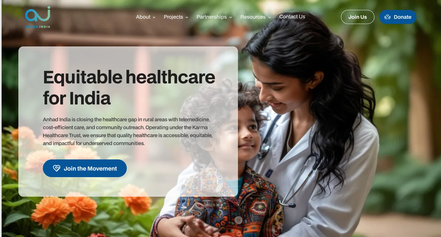
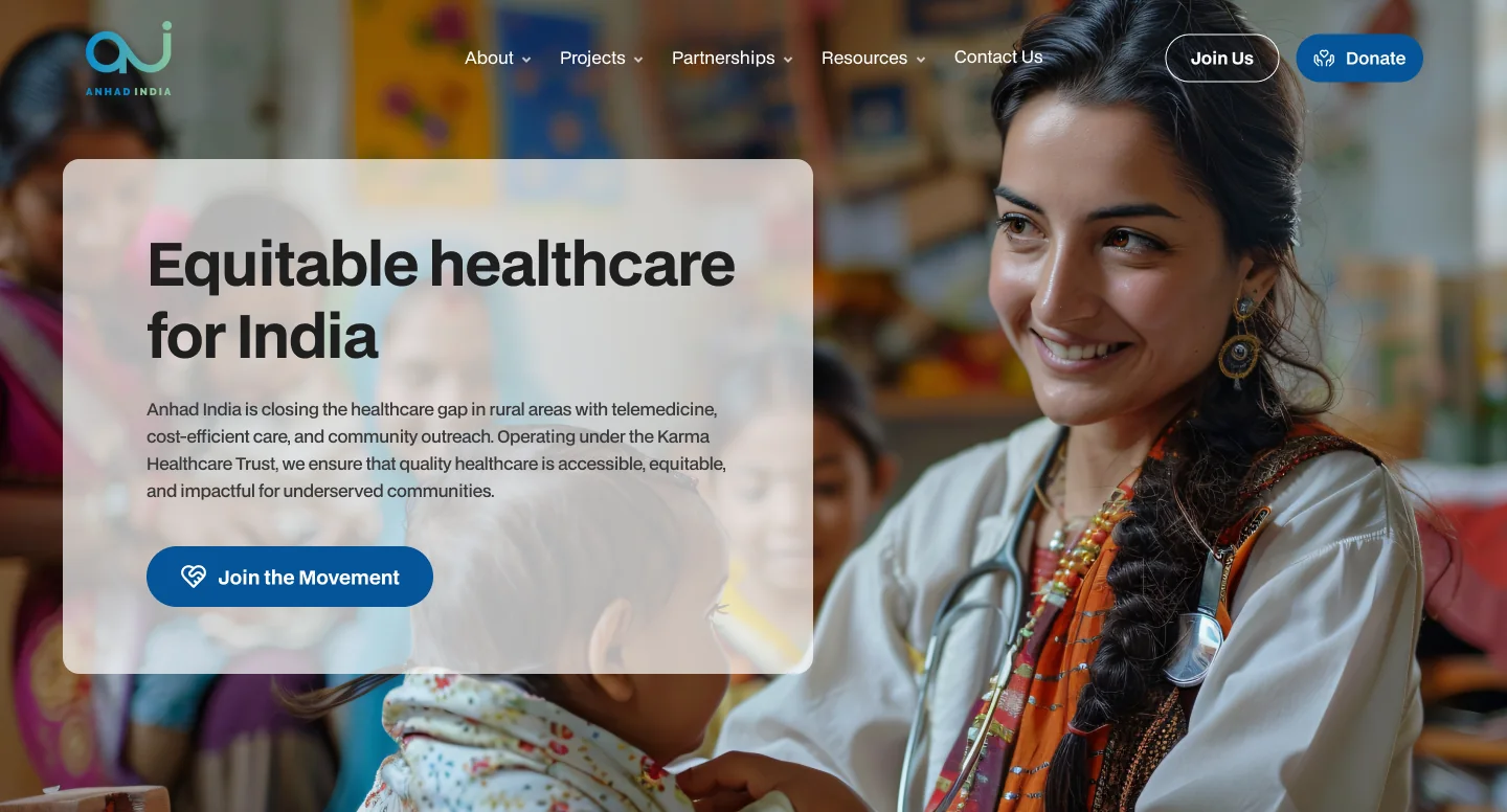
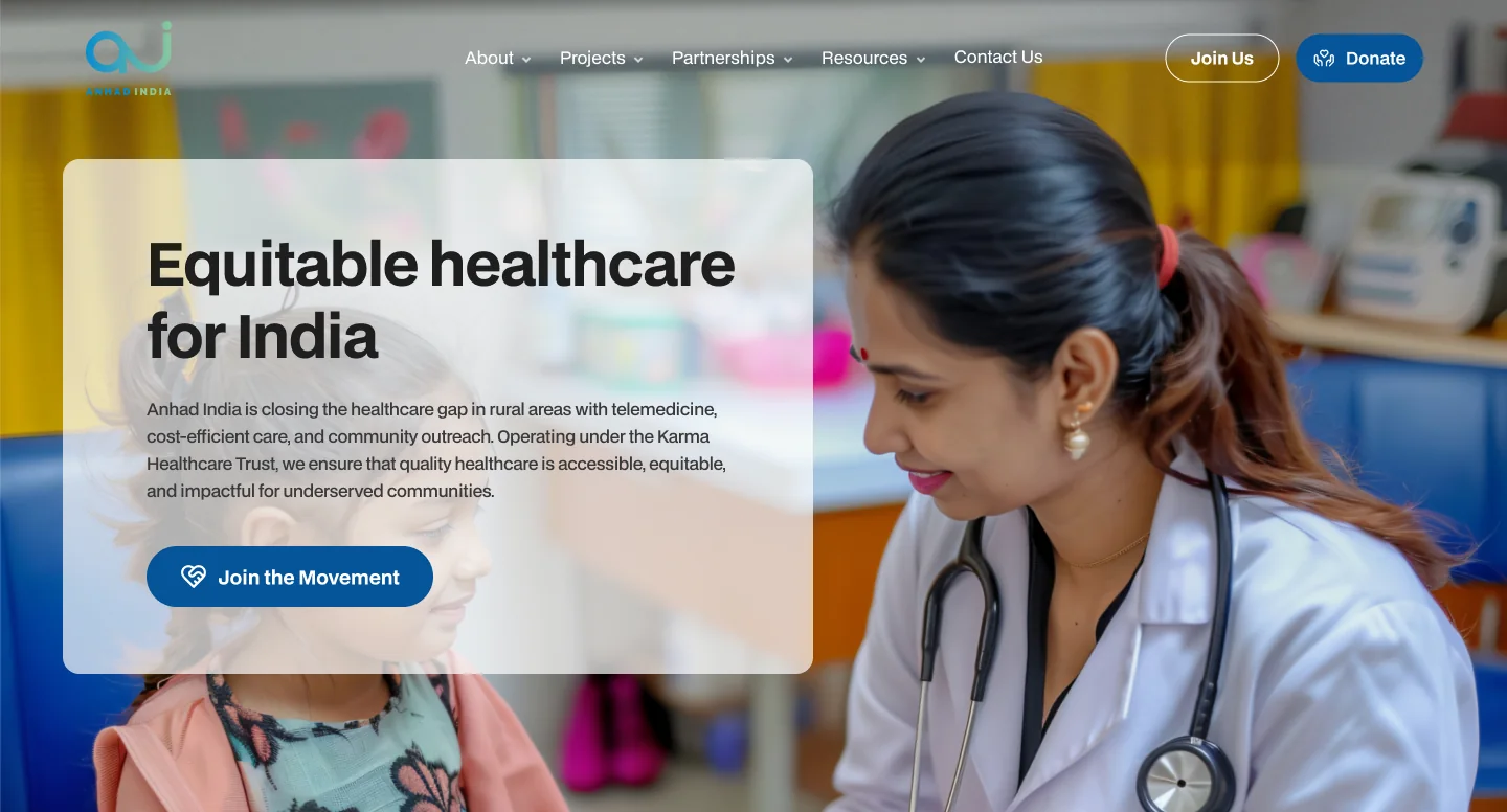
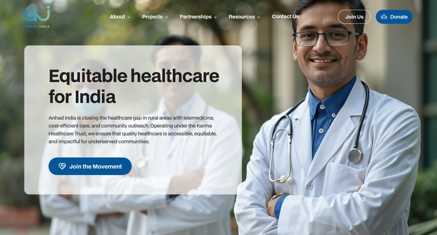
“Equitable healthcare for India” over a rotating set of portraits of care, and a single primary button: Join the Movement. Join Us and Donate stay pinned in the header on every page.
Data, designed
The argument, in three numbers.
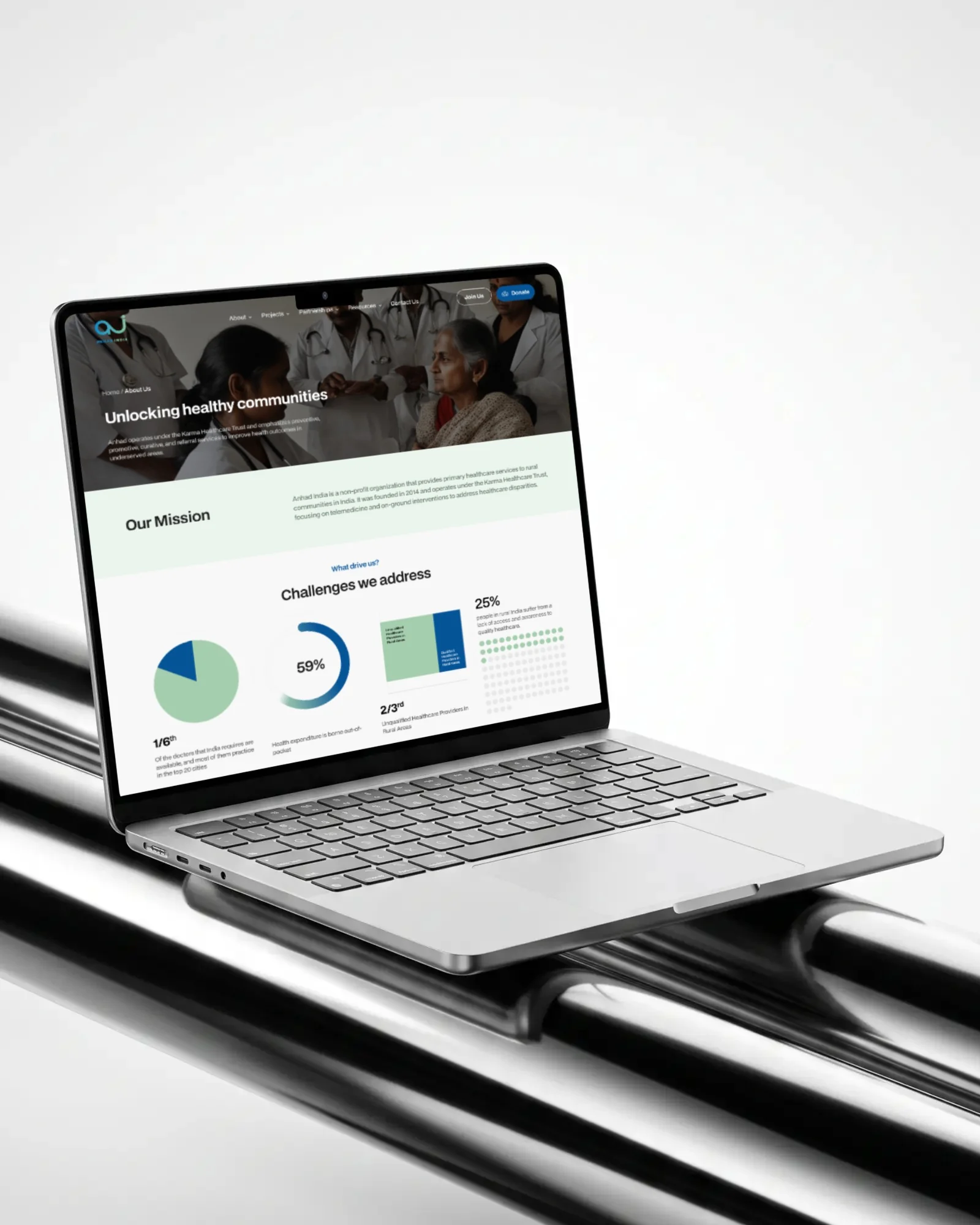
Instead of leading with appeals, the site makes its case with data, drawn simply enough to read in a glance: a share, a crowd and a ring. Blue carries the point; the support green holds the comparison.
2/3rd
Unqualified healthcare providers in rural areas
70 Crore
people in rural India lack access to quality healthcare
Health expenditure borne out-of-pocket
Every template
Twelve pages, each one designed at two sizes.
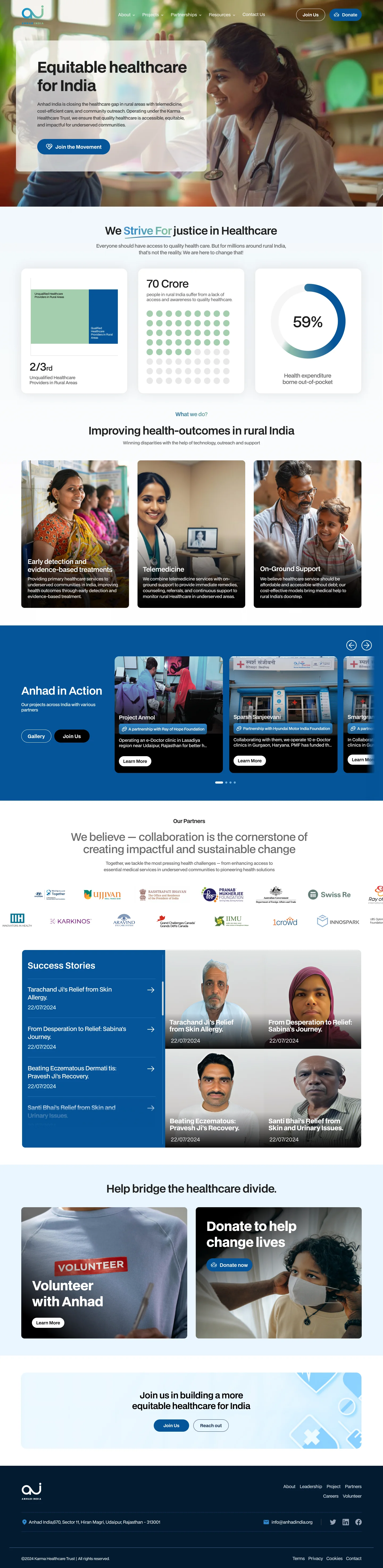
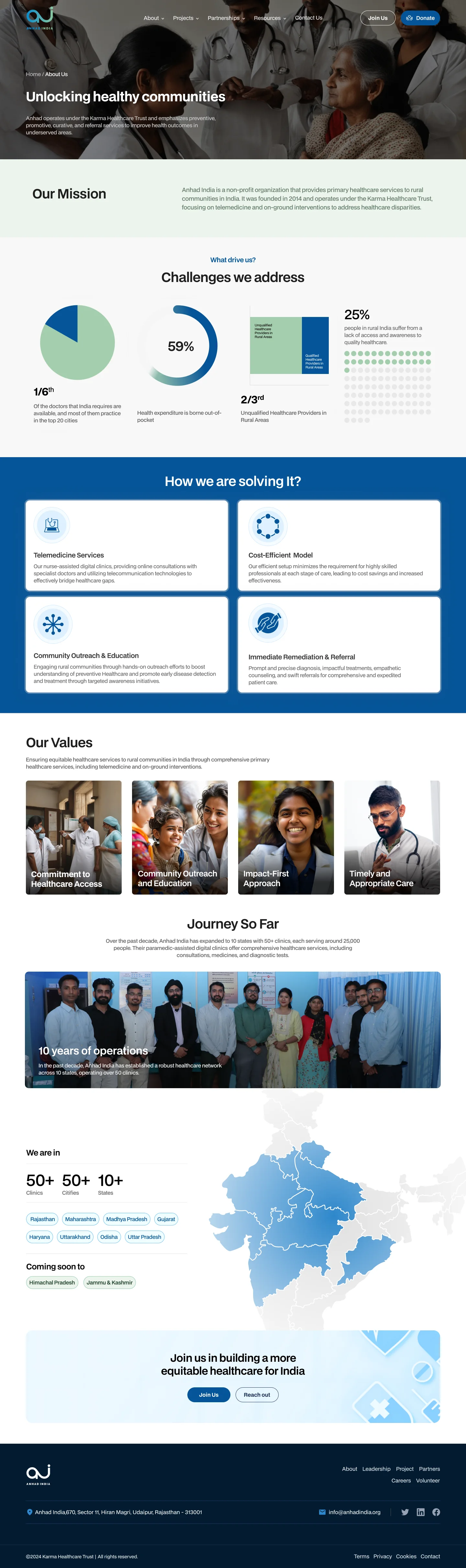
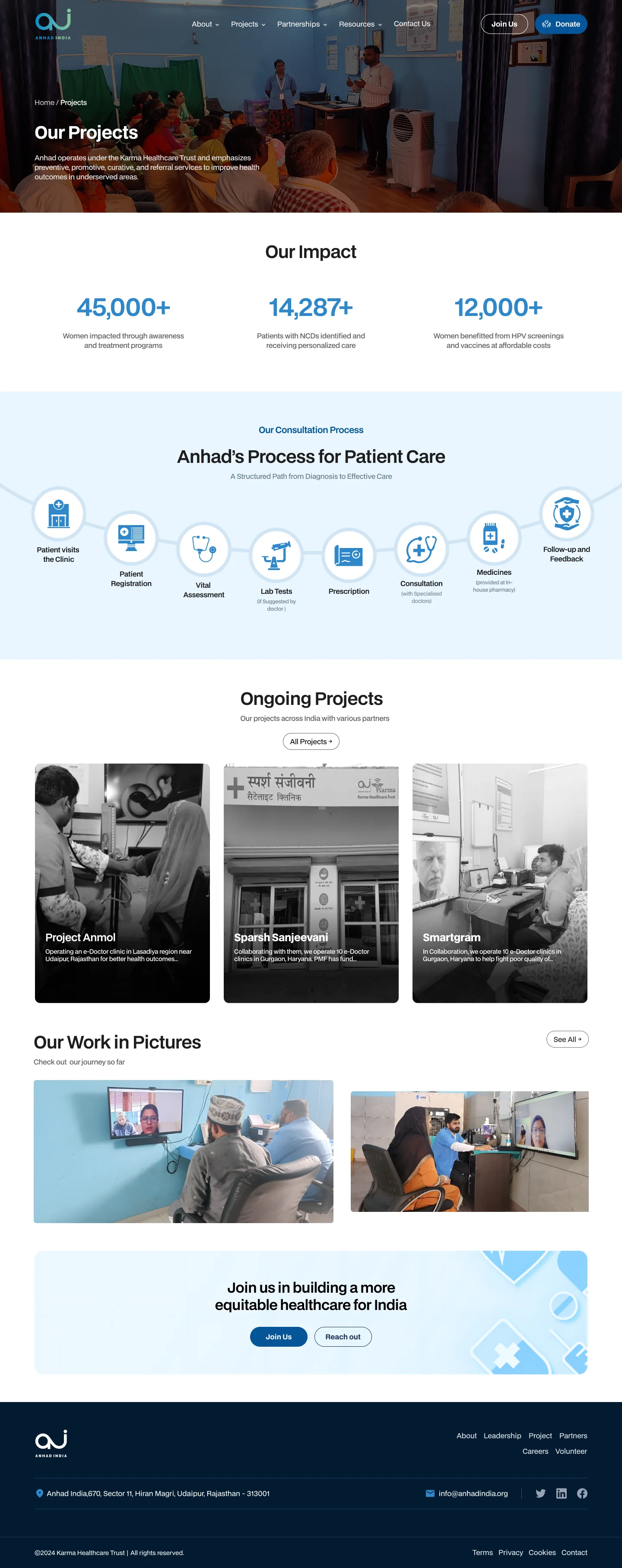
Home, about, projects, a project in depth, partnerships, donate, resources, an article, careers, an open role, leadership and contact, each drawn at 1440px and again at 360px, so no screen on the live site was left to guesswork. Pick a page to see both.
Home: 1440px and 360px, scrolling. Hover to pause.
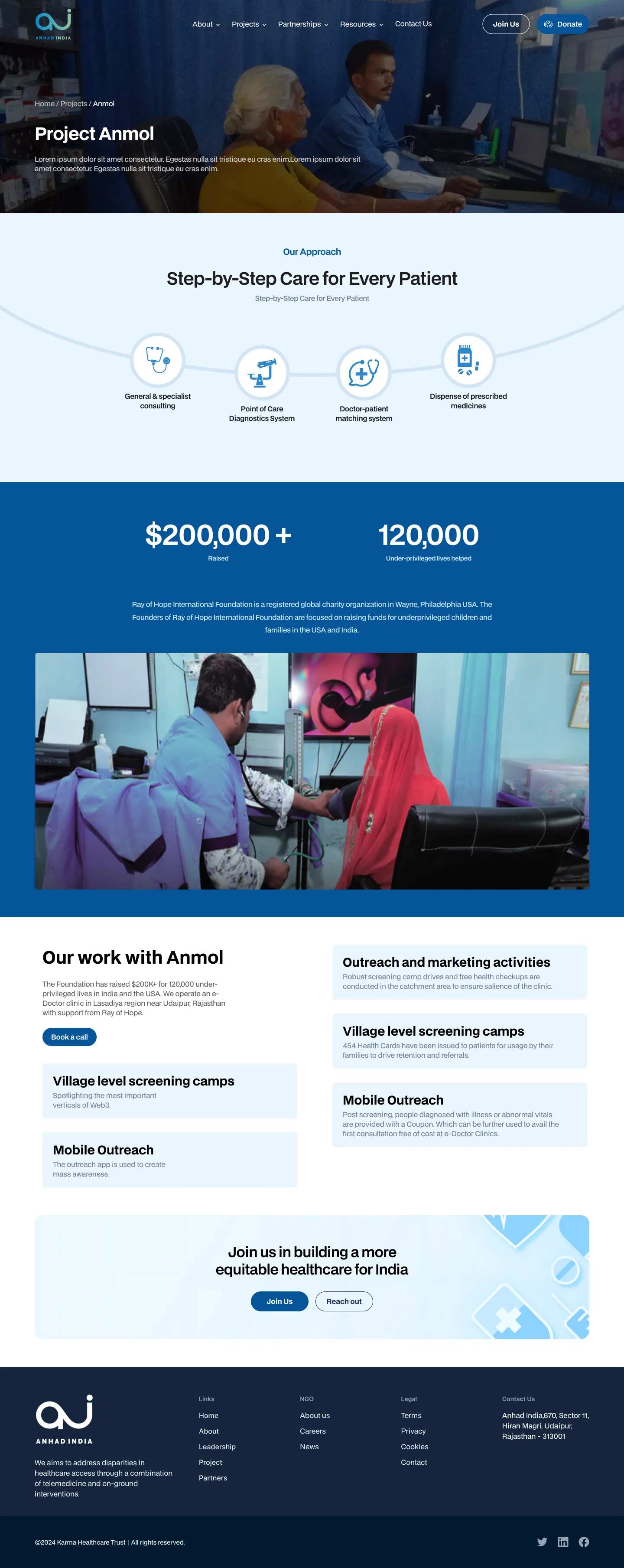
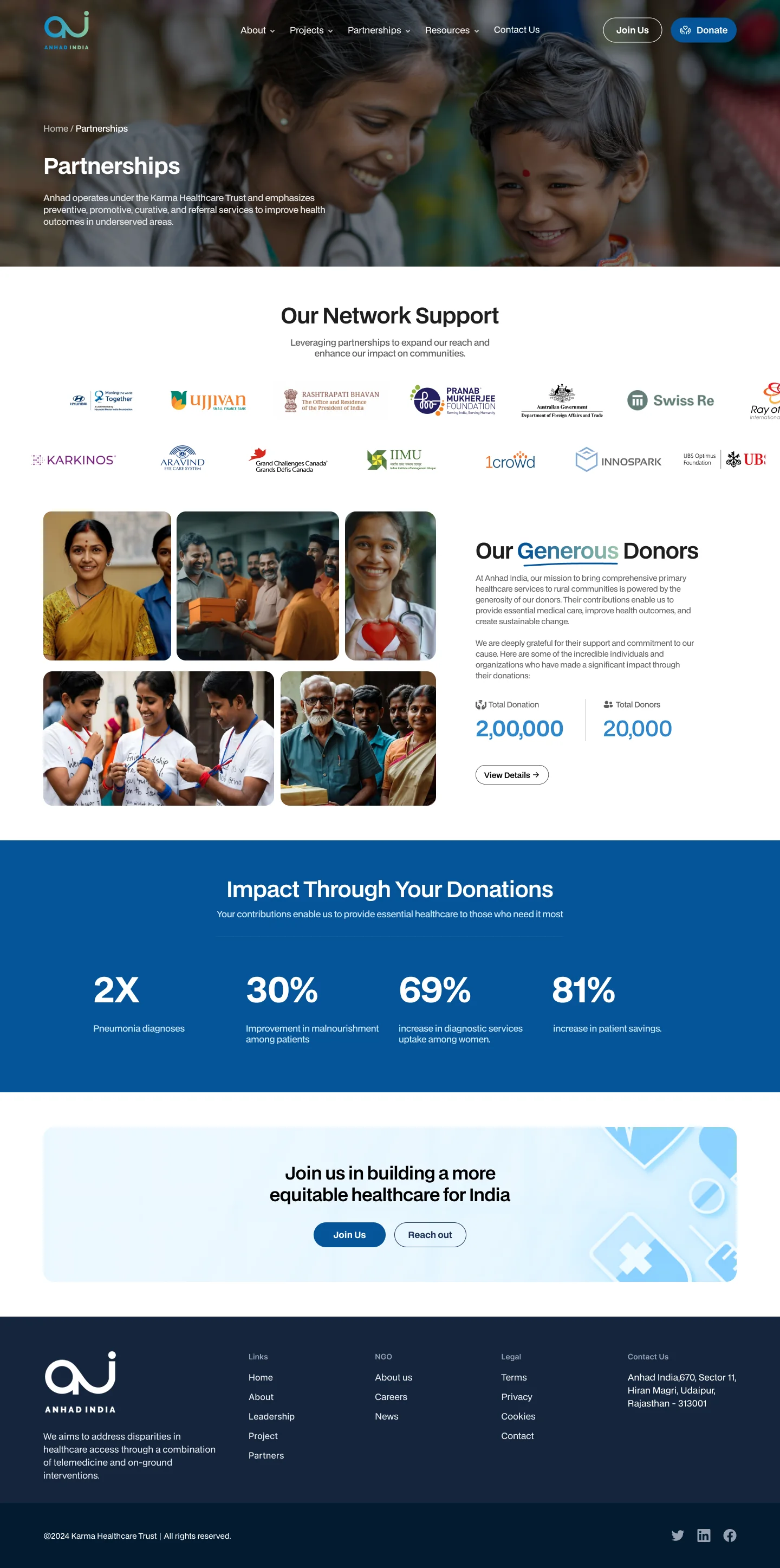
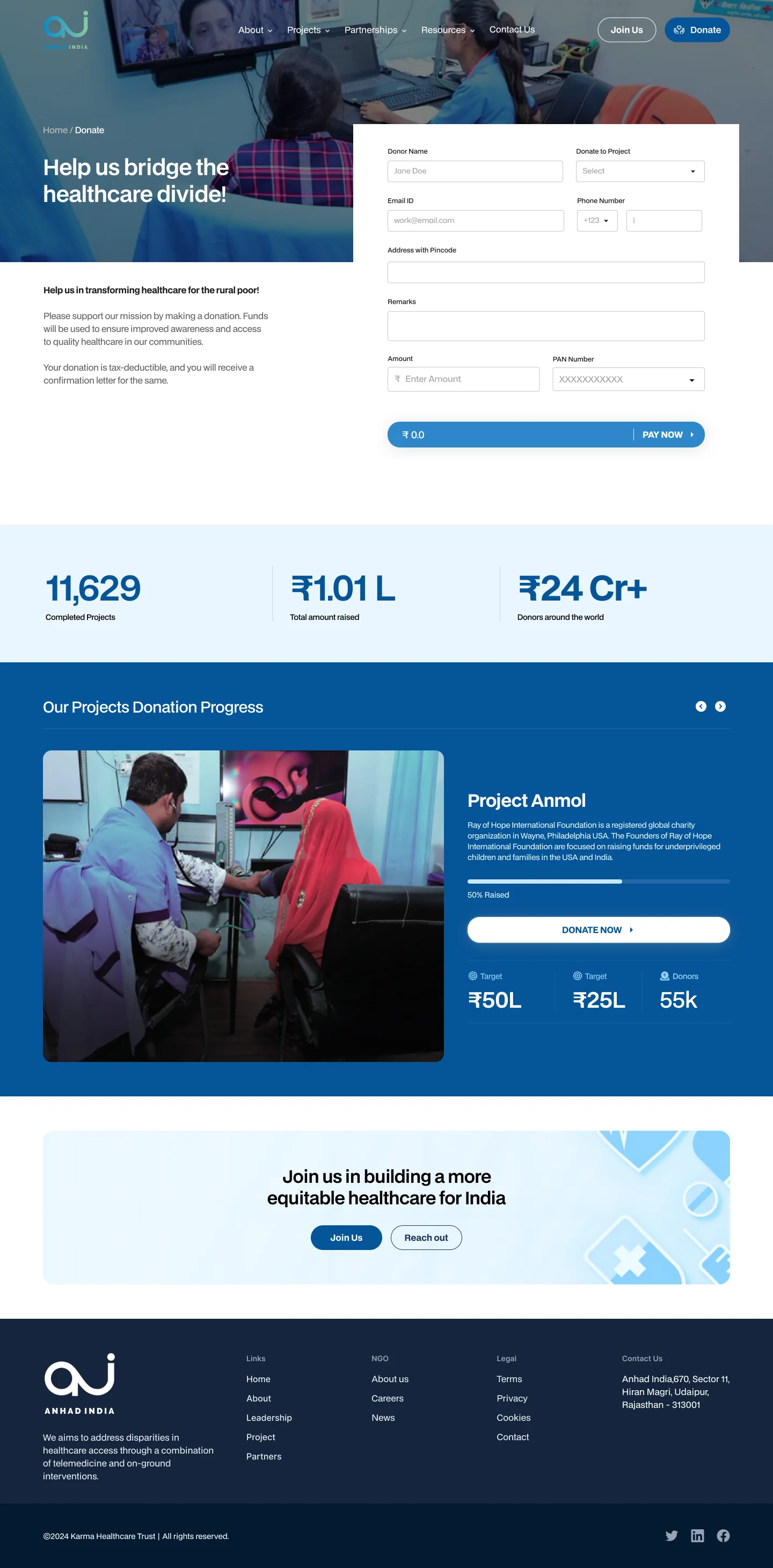
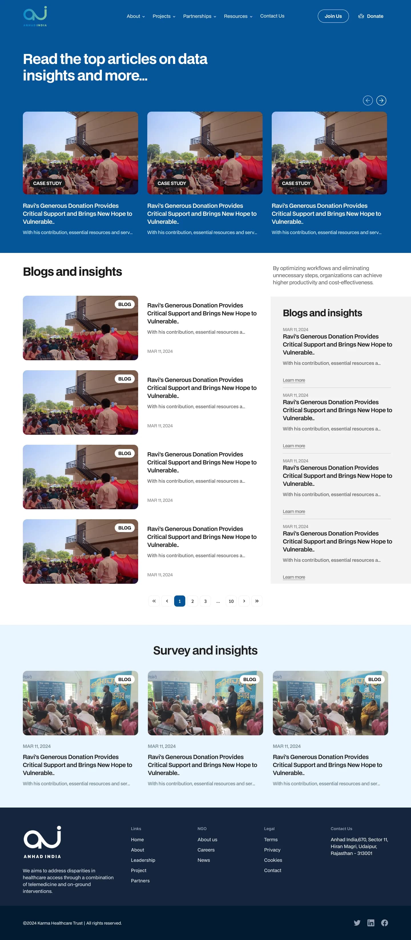
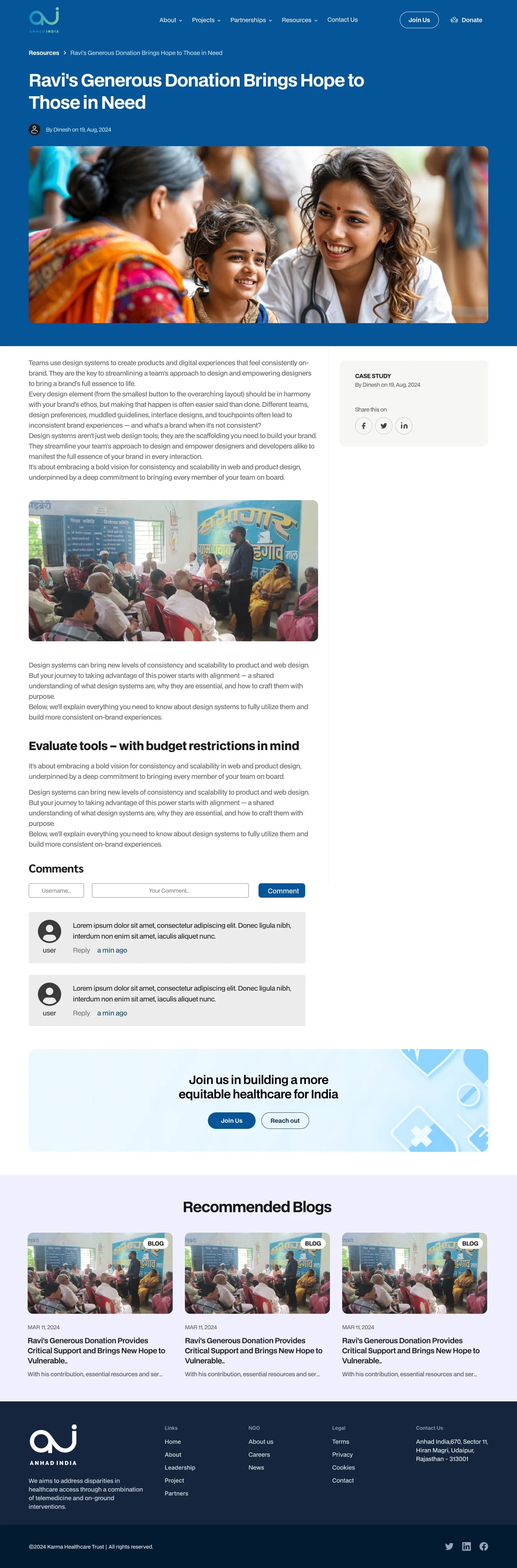

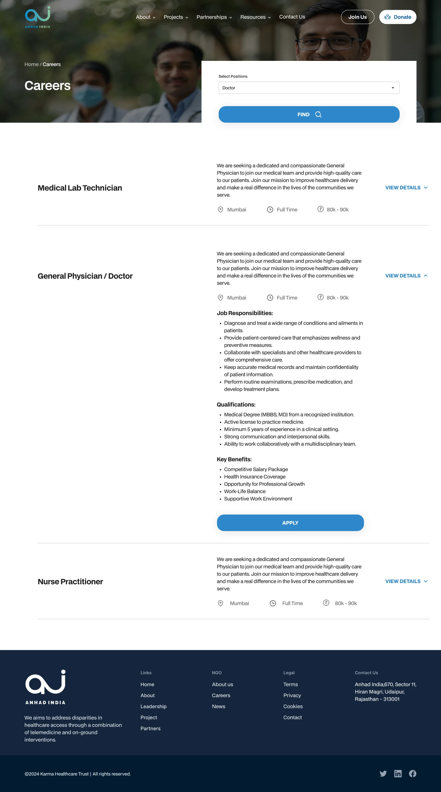
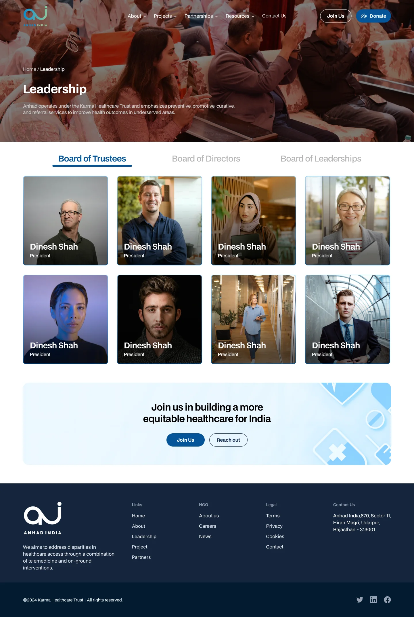
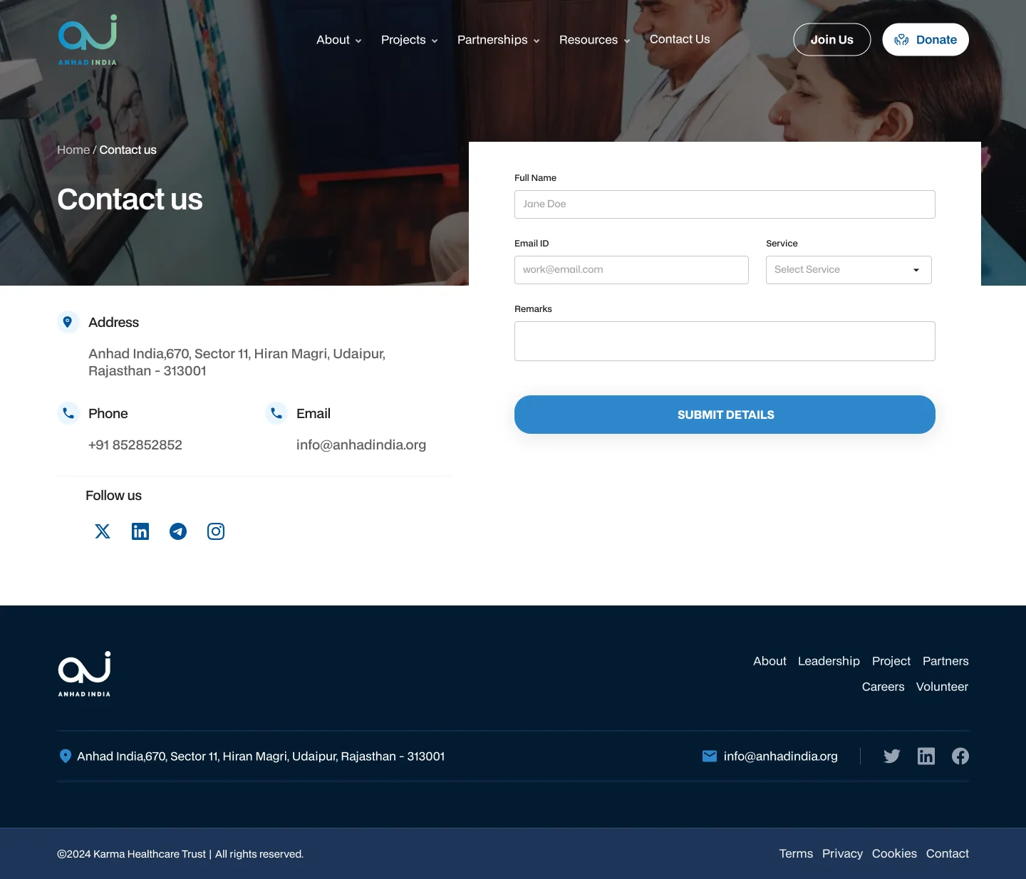
12 + 11
Desktop templates and mobile screens, every one designed, none inferred
Design language
Calm, clinical blue, with a green that cares.
A health charity has to feel trustworthy before it feels moving. The palette is one deep blue with a soft support green, set on pale blue and white surfaces, and a single grotesk across the site.
- Primary blue#055498Buttons, links, bands, charts
- Navy#021B31Footer and deep surfaces
- Pale blue#E9F6FFCall-to-action bands and panels
- Support green#A5CEAEThe second value in a comparison
- Green tint#EBF4EDMission and reading sections
- Ink#1E1E1EHeadings and body text
Typeface
Aa
BDO Grotesk
Regular · Medium · DemiBold · Bold · ExtraBold
Outcome
Live, and it moved the numbers.
The new site is live. After launch, website traffic rose by 40% and donation volume by 6%: more people finding the work, and more of them choosing to fund it.
- +40%
Website traffic
More people reaching Anhad's work after the new site launched.
- +6%
Donation volume
More of those visitors choosing to give, with Donate one click away on every page.
- 23
Screens shipped
Twelve desktop templates and eleven mobile screens, designed end to end.
Next case study
Rêve: a brand and a website for slow stays in Goa
Read it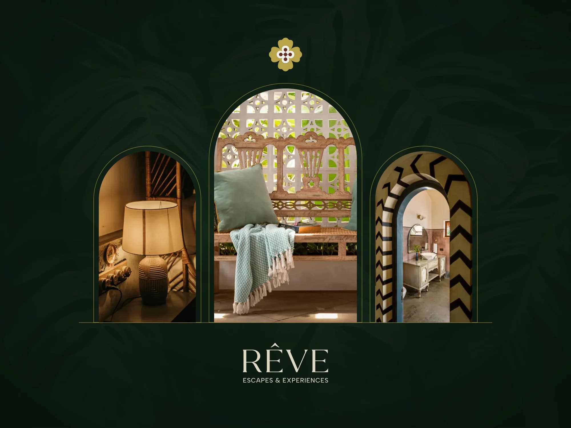
Facing a similar problem?
Start a project