Case study · Design system · Desktop web
The system behind the showroom floor.
A production design system, Steer v1.0, and the dealership analytics surfaces built on it. Token-first, state-complete, and handed to engineering without a spec question.
- Client
- ReadywireDealership operating system
- Industry
- Automotive SaaSDealership back-office
- Role
- Product DesignerDesign system & UI
- Year
- 2025Desktop web
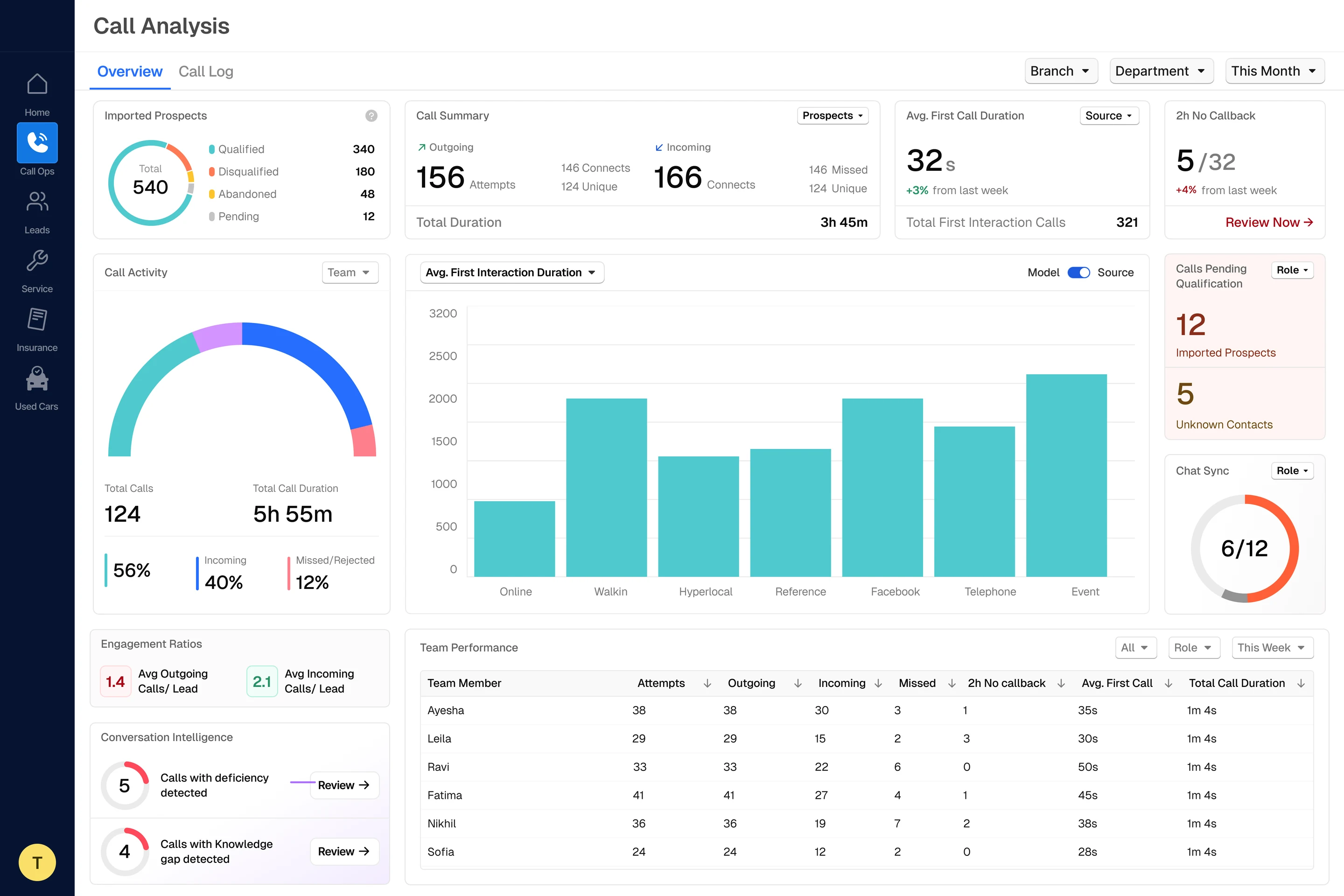
Call Analysis · 10 library parts, 0 one-offs
Context
A platform this broad cannot be designed screen by screen.
What Readywire does. Readywire is the operating layer for automotive dealerships: calls, leads, service, insurance, used-car inventory and field reps all run through one platform.
Why it needed a system. Features were shipping faster than the interface language could absorb them. Every new module re-invented its own buttons, spacing and status colours.
The brief was not “make it look better.” It was to build the foundation that lets six product areas look and behave like one product, and keep doing so after I am no longer the person drawing every screen.
Before: six modules, six interface languages
166
Connects today
642
Imported leads
38
Open job cards
12
Renewals due
57
In inventory
10/12
Reps online
Scope
Built from the token up, then applied in anger.
Foundations first, components second, product surfaces third, so every screen that followed was an assembly job, not a drawing job.
- 0
Colour tokens
- 0
Component variants
- 0
Type styles
- 0
Elevation levels
Foundations · Colour
Nine ramps. One logic.
Every hue resolves on the same ten-step curve, so swapping a semantic role (info to warning, success to critical) never changes contrast behaviour.
- Primary
- Green
- Red
- Yellow
- Blue
- Purple
- Teal
- Neutral
- Alpha white
- Alpha black
110 tokens · hover any swatch for its name
03 — Colour logic
Orange is the only loud colour.
A dealership dashboard is wall-to-wall data. If everything can be branded, nothing reads as urgent.
- Primary ×10
Reserved for the single primary action and live state. Never decoration, never a large fill.
Live - Green / Red ×20
Carry meaning only: target met, target missed. Never used as a brand accent.
Target metTarget missed - Blue / Purple / Teal ×30
Categorical series in charts, where hues must stay distinguishable but none should dominate.
- Yellow ×10
Warning and pending states, kept distinct from the primary orange at every step of the ramp.
Pending callback2h no callback - Neutral ×16
The widest ramp in the system, because most of the interface is structure: surfaces, dividers, table rows, disabled text.
Ayesha38Leila29Ravi33 - Alpha ×24
Overlays, scrims and hover washes that sit over unknown backgrounds without inventing a new opaque token.
Dialog
Foundations · Typography
A scale sized for density.
Geist, cut to eight steps across three roles: heading, paragraph, label. Every step locks size, weight, line-height and tracking, so a table row stays legible without anyone re-deciding the type.
- Heading 136 / SemiBold 650 / 64 / −0.3
Cook up an exquisite deal, before you blink.
- Heading 232 / SemiBold 650 / 56 / −1.4%
Cook up an exquisite deal, before you blink.
- Heading 324 / SemiBold 650 / 32 / −0.2
Cook up an exquisite deal, before you blink.
- Heading 420 / Medium 550 / 28 / −0.2
Cook up an exquisite deal, before you blink.
- paragraph-lg16 / Regular 450 / 24 / −0.2
Cook up an exquisite deal, before you blink.
- paragraph-md14 / Regular 450 / 20 / 0
Cook up an exquisite deal, before you blink.
- paragraph-sm12 / Regular 450 / 16 / 0
Cook up an exquisite deal, before you blink.
- captions11 / Medium 550 / 14 / 0
Cook up an exquisite deal, before you blink.
Foundations · Elevation
Depth is a token, not a judgement call.
Seven levels, Shadow-0 through Shadow-600, so a dropdown over a chart over a modal never has to argue about which one sits on top.
- Shadow-0
- Shadow-100
- Shadow-200
- Shadow-300
- Shadow-400
- Shadow-500
- Shadow-600
Components · Buttons
Four variants (default, primary, tertiary, plain), three tones (default, critical, success), three sizes and seven states, every one drawn rather than inferred.
| rest | hover | focus | active | pressed | disabled | loading | |
|---|---|---|---|---|---|---|---|
| default | |||||||
| primary | |||||||
| tertiary | |||||||
| plain | n/a |
Hover, press and click it: the states are the library's, not a recording.
Components · Badges
80 badges, because status is the product.
Tones across strong and subtle weights, with optional leading or trailing icon and two sizes. On a dealership floor the badge is what a manager actually reads: live, missed, converted, idle.
| Lead | Model | Status |
|---|---|---|
| Srikanth Ravi | Brezza | Live |
| Nisha Sharma | Swift | Missed |
| Priya Kapoor | Baleno | Converted |
| Rohan Desai | Alto | Idle |
| Aarav Mehta | Celerio | Pending |
6 colour tones + enabled and disabled · subtle or strong · two sizes · optional icon = 80 badges
Components · Inputs
Seven states each, including the two everyone forgets.
Text and multiline fields both carry rest, hover, active, focus, disabled, read-only and error, plus a borderless variant, prefix and suffix slots, segmented steppers and an inline error component.
State: Rest
- RestLead nameEditSrikanth RaviAs on the booking form13/120
- HoverLead nameEditSrikanth RaviAs on the booking form13/120
- ActiveLead nameEditSrikanth RaviAs on the booking form13/120
- FocusLead nameEditSrikanth RaviAs on the booking form13/120
- DisabledLead nameEditSrikanth RaviAs on the booking form13/120
- Read-onlyLead nameEditSrikanth RaviSynced from the CRM13/120
- ErrorLead nameEditSrikanth RaviEnter the lead's full name13/120
System → Product
Then the system had to survive contact with real data.
Five dealership-facing surfaces, assembled entirely from the library: dense tables, live call states, multi-series charts, map views and overlay panels, with no one-off styling introduced along the way.
- 01
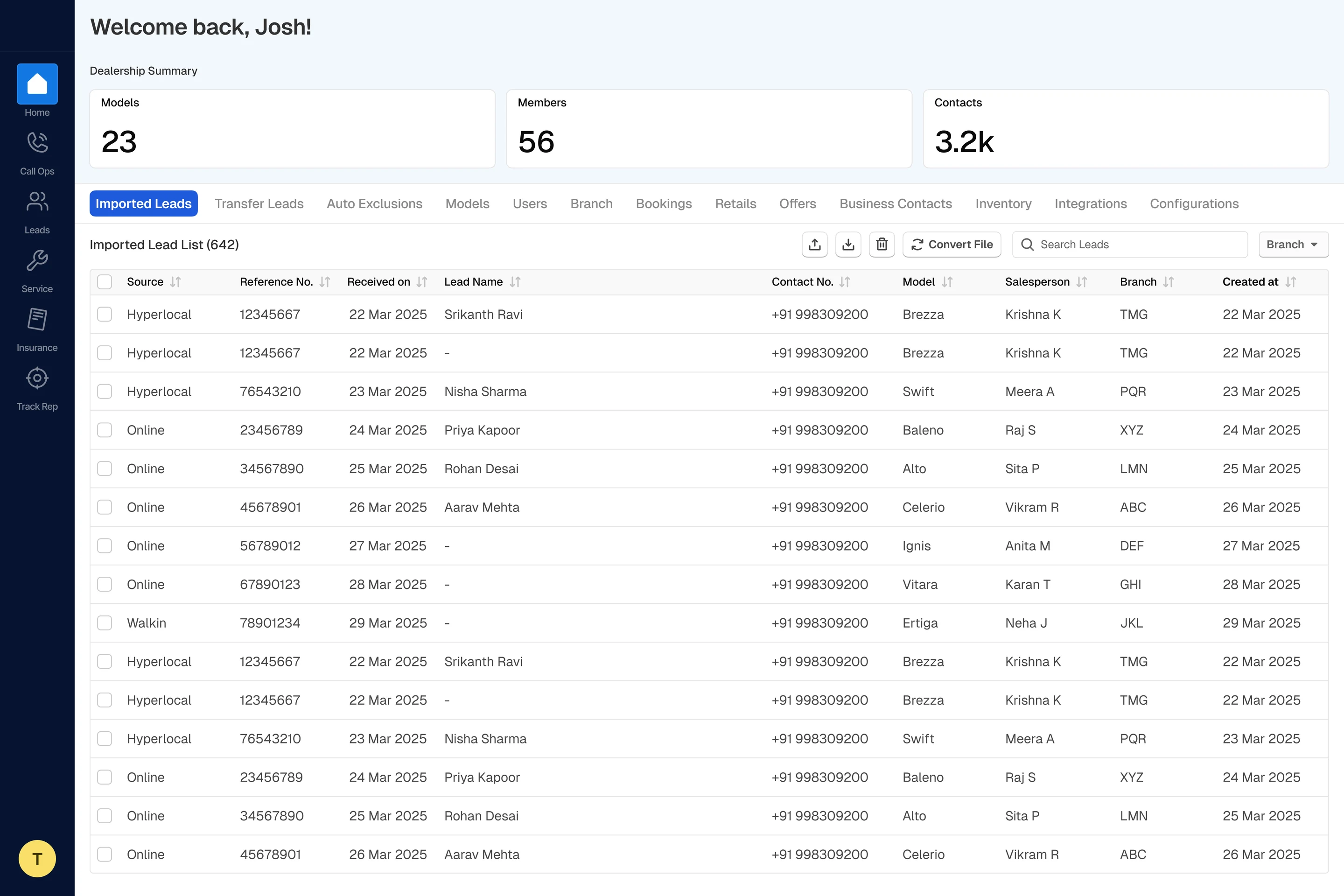
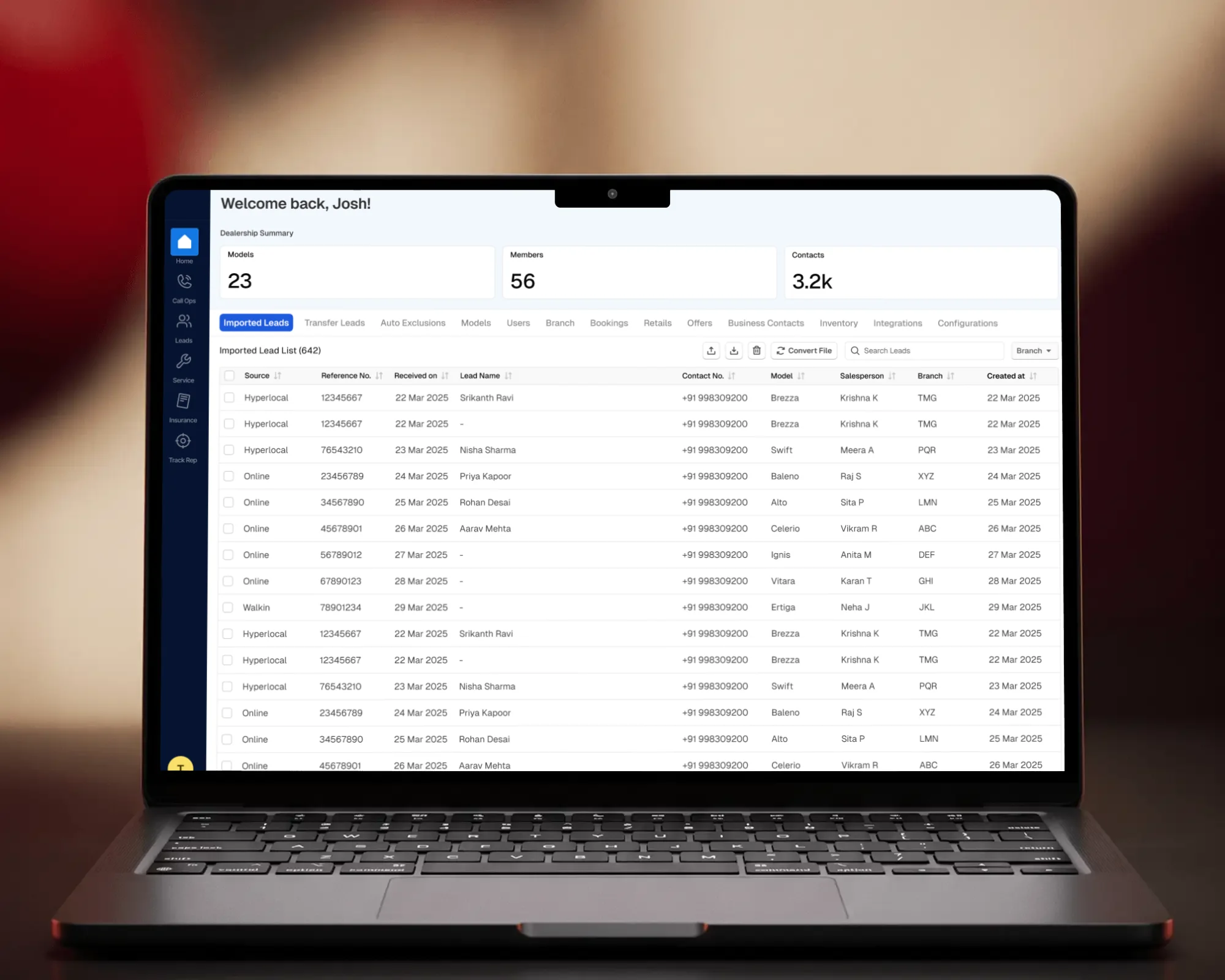
Home
The dealership’s opening view: the shell every other surface inherits.
- 02
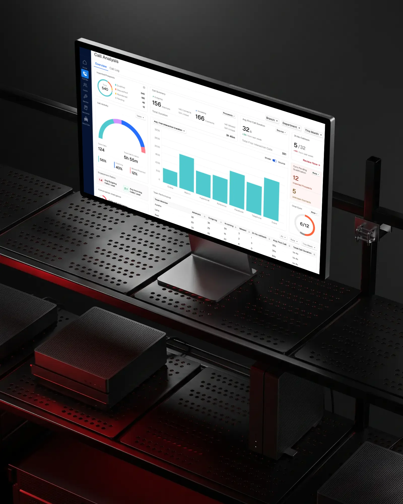
Call Analysis
Call volume, incoming and outgoing ratios, per-rep performance.
- 03
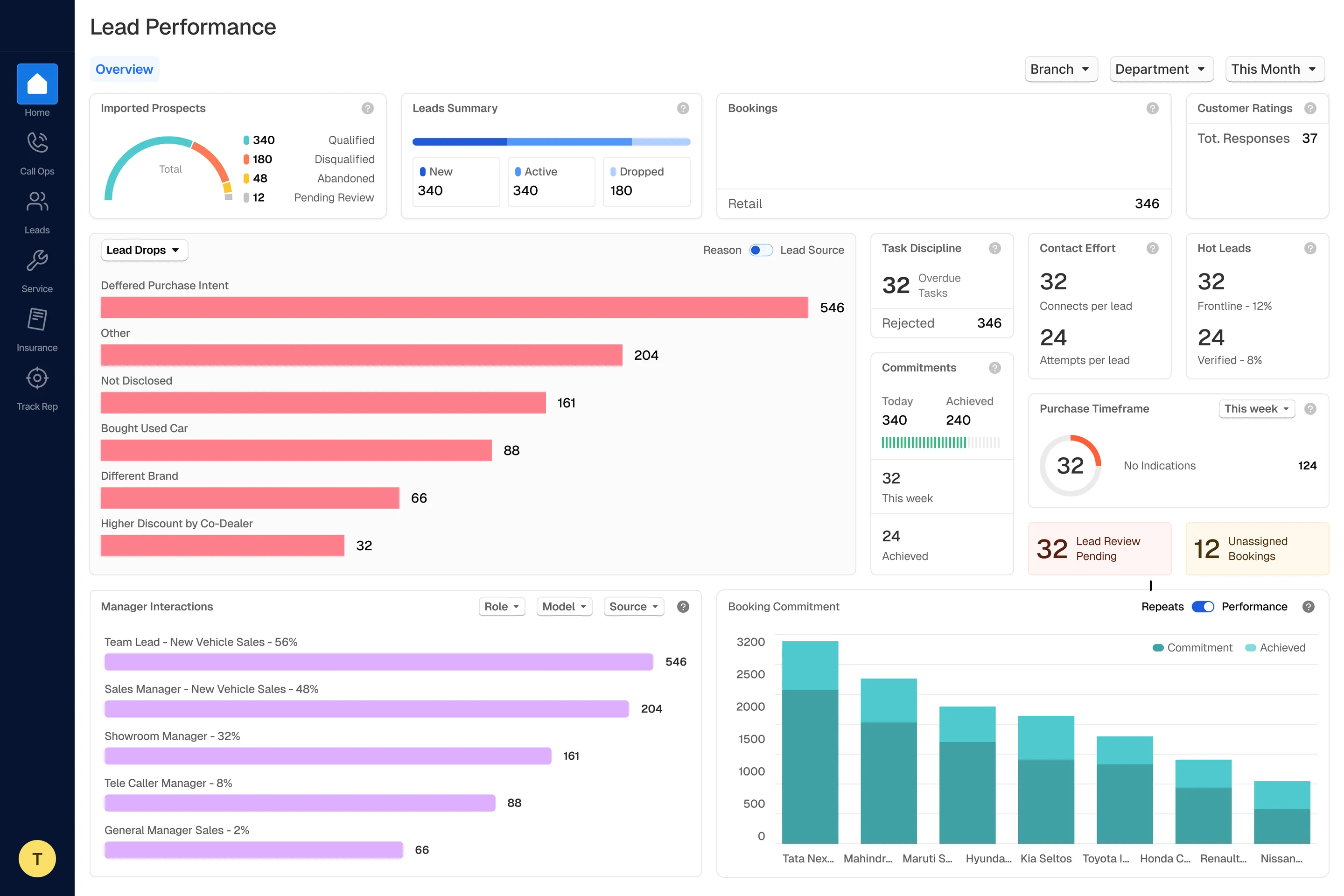
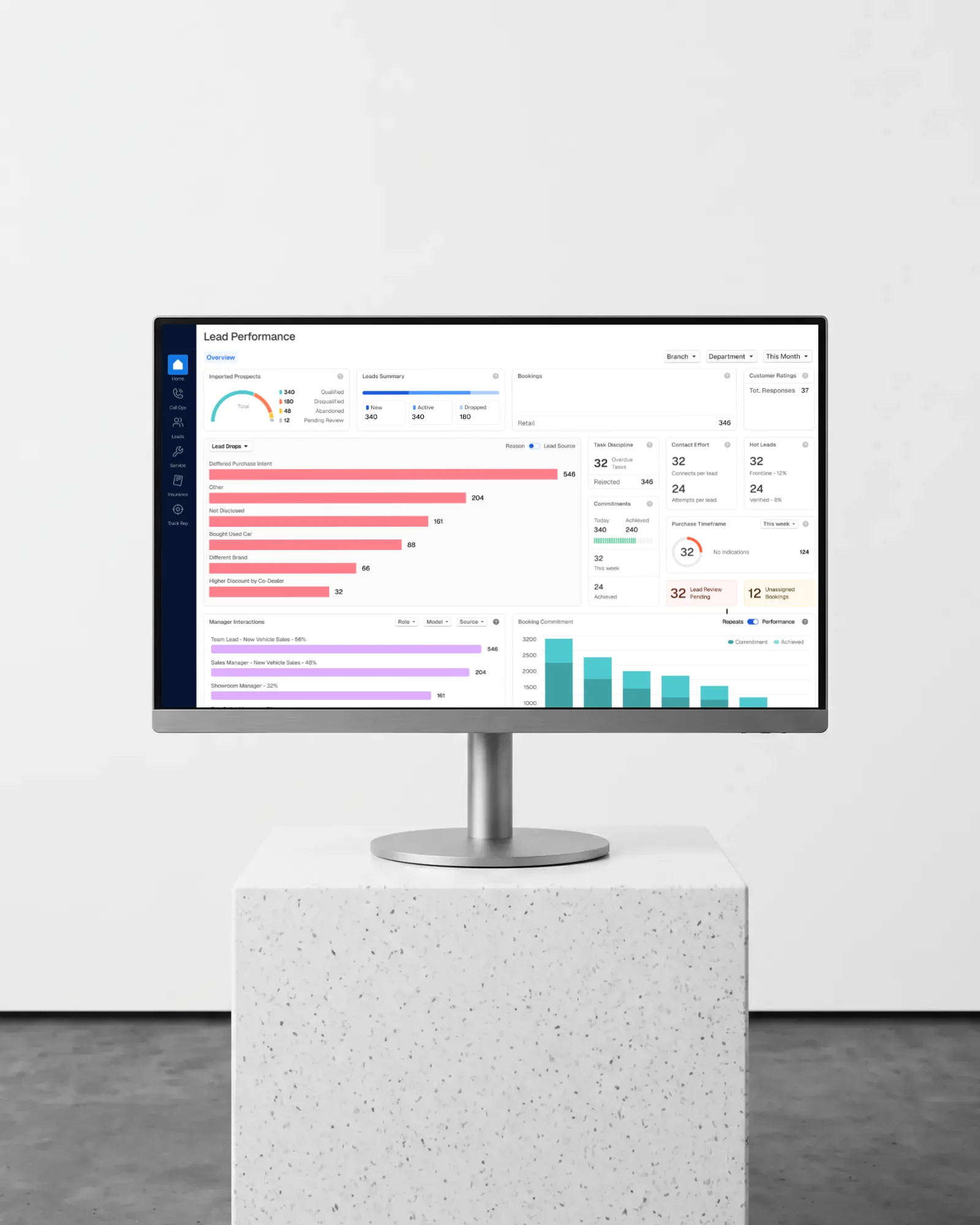
Lead Performance
Lead flow, manager interactions, booking commitments, active-lead overlays.
- 04
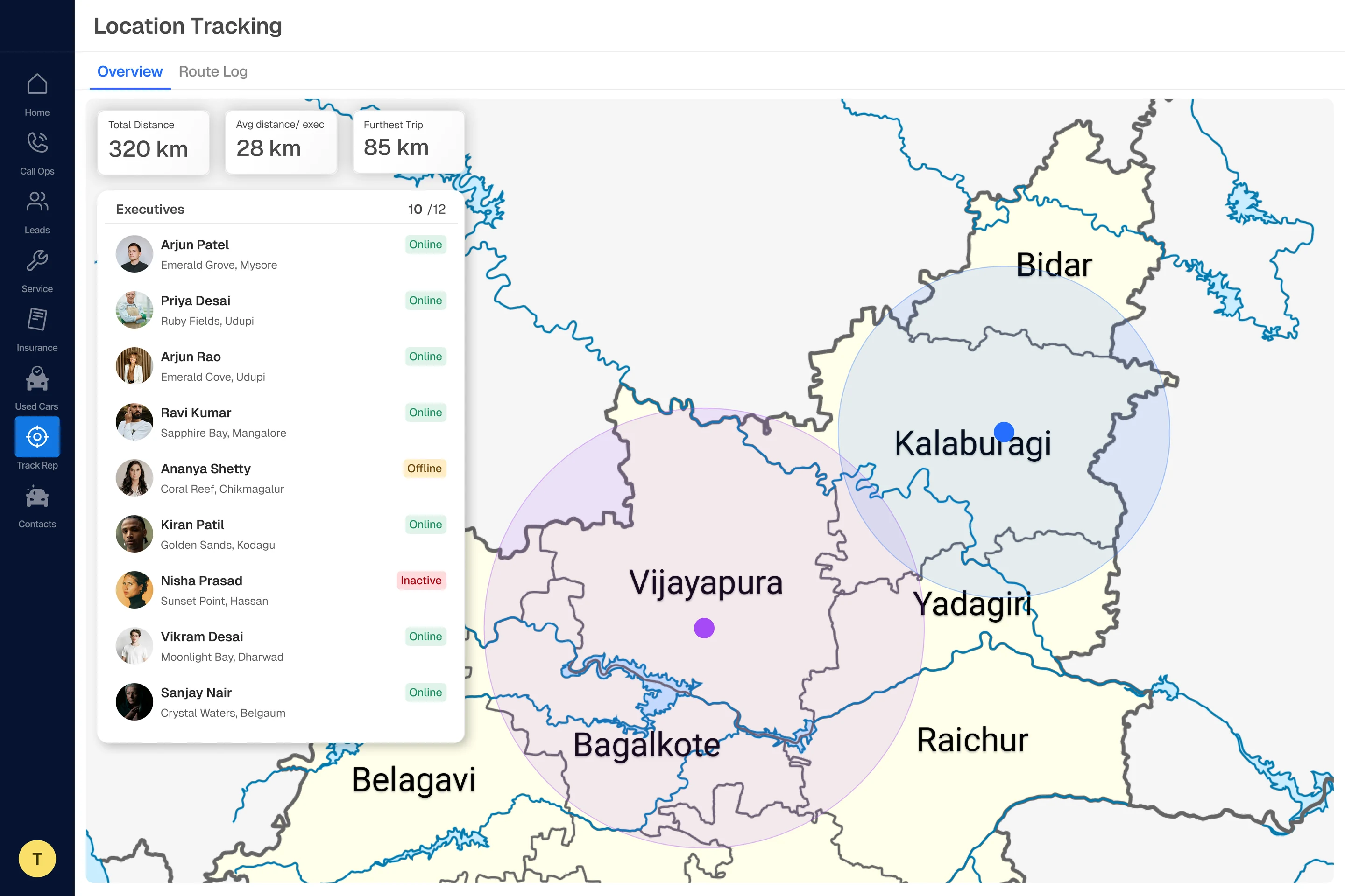
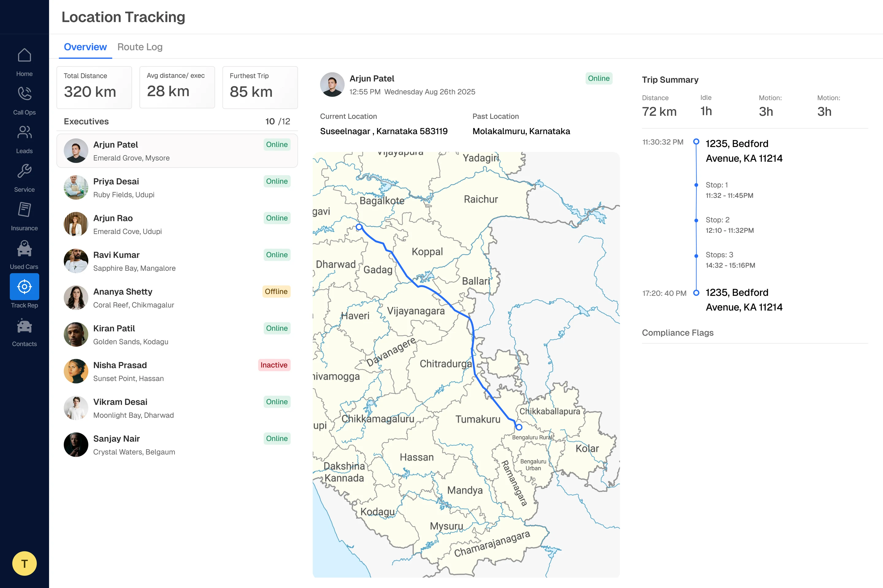
Location
Field-rep tracking and trip summaries, a surface type the library was never designed for.
The shell every other surface inherits.
Home sets the frame: sidebar navigation across Call Ops, Leads, Service, Insurance, Used Cars, Track Rep and Contacts. Get this wrong and every module inherits the mistake.
Neutral-1600 → Neutral-700 · structure only
Where the floor gets measured.
Call analysis reads volume, incoming and outgoing ratios and per-rep performance. Categorical hues separate the series; green and red stay reserved for target met and target missed.
Categorical hues · semantic green / red
The densest surface in the product.
Lead performance tracks flow and conversion: manager interactions, booking commitments and active-lead overlays. The real test of whether a sixteen-step neutral ramp was over-engineering or exactly right.
Neutral ×16 · the ramp earning its keep
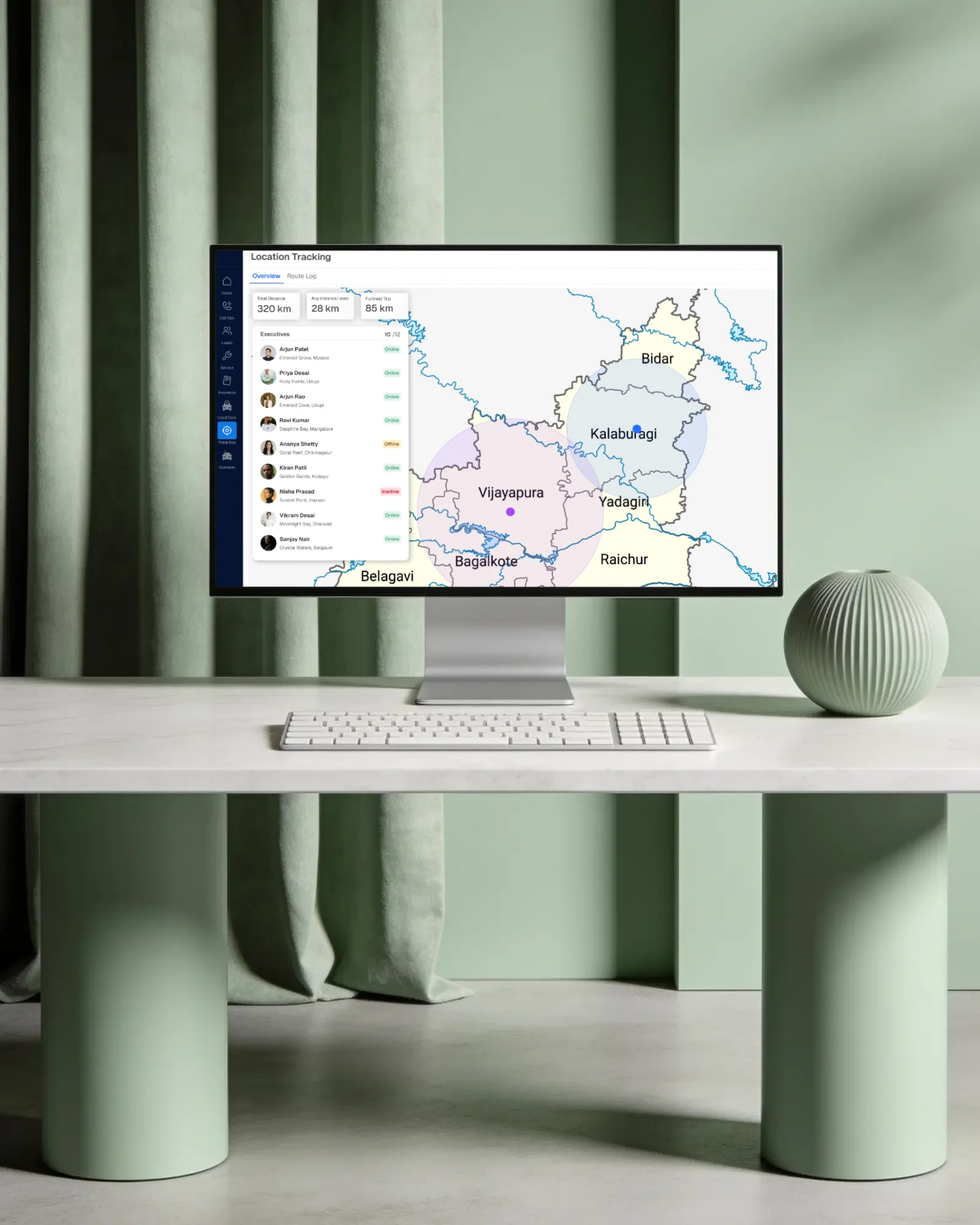
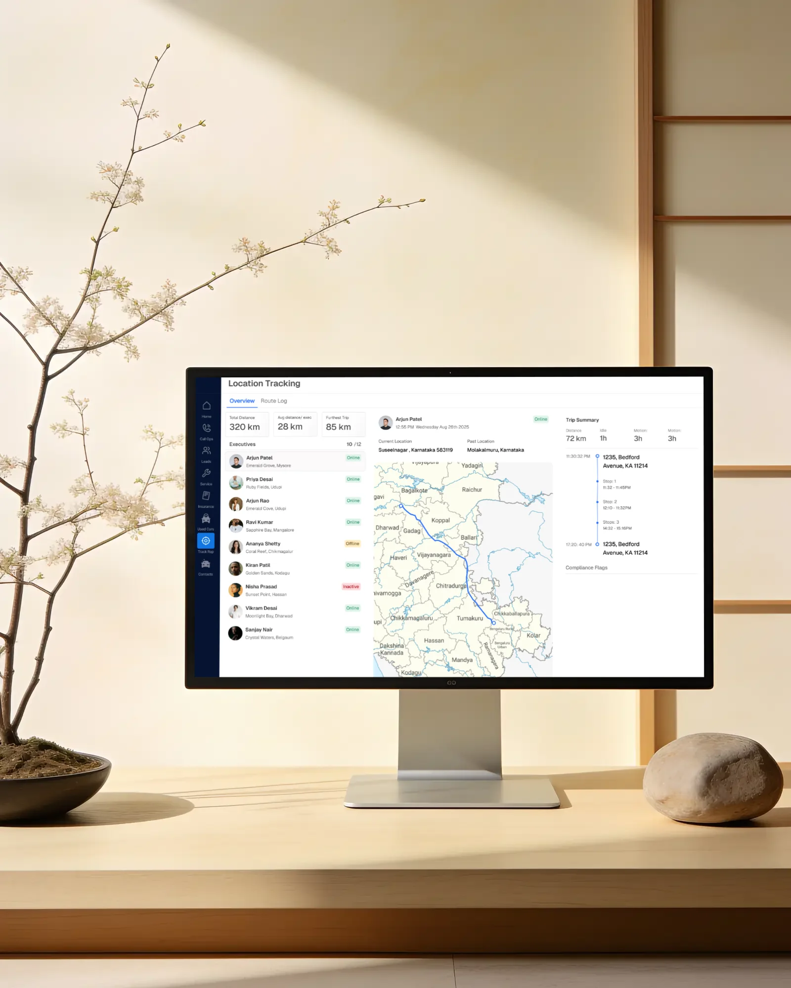
The system stretched to a map.
Field-rep tracking and trip summaries, a surface type the library was never designed for, built without adding a single new token. That is the test of whether a system is a system.
Location · overview and route
Outcome
What the system actually bought them.
- 01
One product, not six modules
Call Ops, Leads, Service, Insurance, Used Cars and Track Rep stopped looking like separate tools sharing a navigation bar.
- 02
Handoff without interrogation
119 button variants and seven input states meant engineering read interaction behaviour off the file instead of out of a meeting.
- 03
New surfaces, no new tokens
The map views were assembled entirely from existing foundations: the clearest evidence the system generalises beyond what it was drawn for.
All figures shown in the product screens are placeholder data used to demonstrate layout and state, not real dealership performance data.
Next case study
A front door for rural healthcare: Anhad India's website
Read it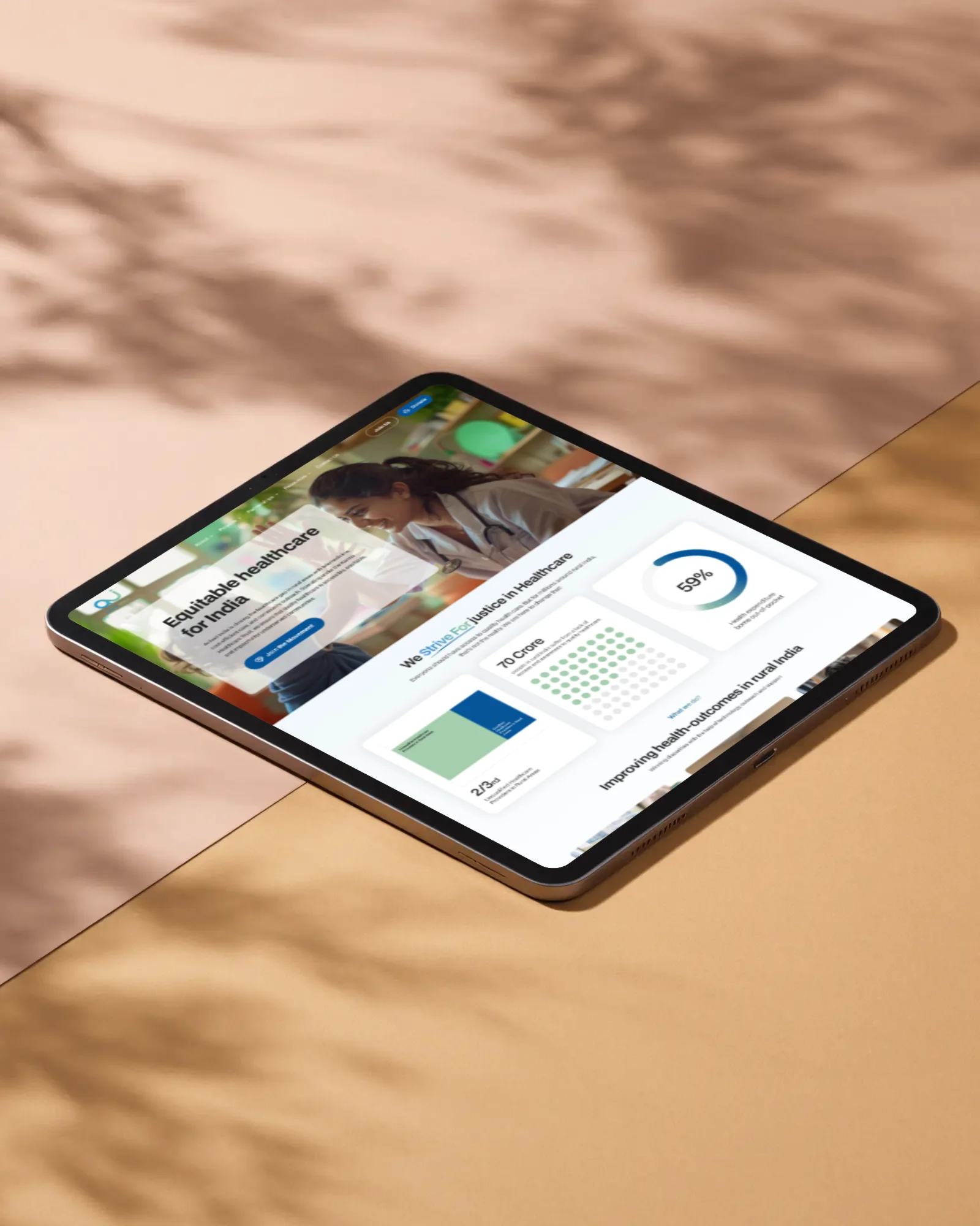
Facing a similar problem?
Start a project