Case study · Android + iOS
Shikhar
Rebuilding the order flow of Hindustan Unilever's direct-to-retailer app around how a shopkeeper actually buys.
Catalogue and offers, cart, order summary and assisted ordering, for the kirana owners who restock 20 to 40 lines between customers.
- Client
- Hindustan UnileverThrough Red Baton
- Industry
- B2B commerceFMCG · Kirana retail
- Role
- Product DesignerInteraction · UX flows · UI
- Year
- 2025–26Android + iOS
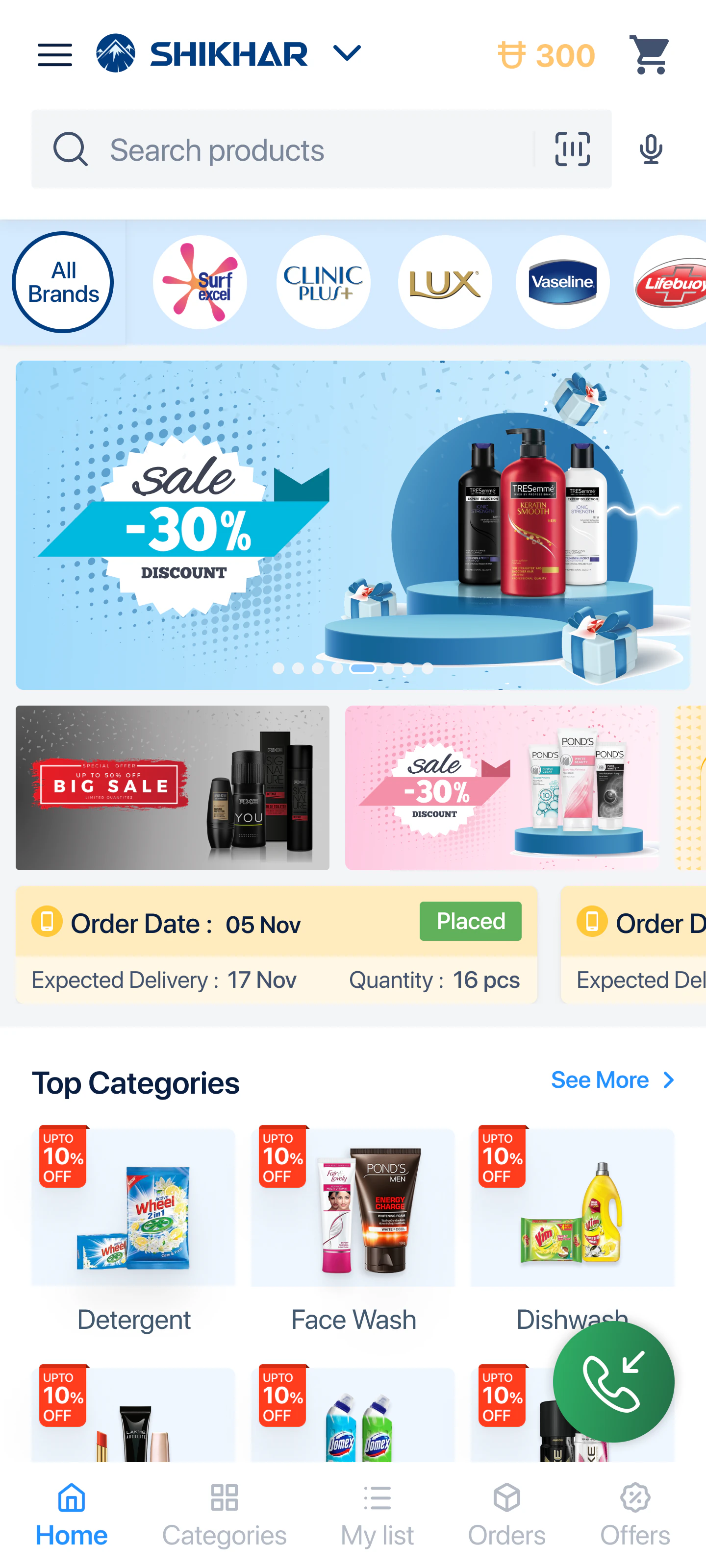
Shikhar had the surface of a consumer shopping app and the workload of a wholesale order desk.
Nearly every friction point I found came out of that one mismatch.
1 Mn+
App installs
$100 Mn+
Transactions processed
Platform figures published by Red Baton: scale context, not outcomes of this work.
- Scope
- Catalogue & offers, cart,
order summary, assisted ordering - Context
- Red Baton, for Hindustan Unilever
Through to development handoff - Note
- All data shown is placeholder,
used for demonstration
Context
The person on the other end is restocking a shop, not shopping.
Shikhar is HUL’s ordering app for kirana stores, the small neighbourhood shops that sell most of India’s FMCG. The owner opens it to restock: detergent, shampoo sachets, tea, soap, the inventory his shop runs on. He orders directly from the brand instead of waiting on a distributor’s salesman.
He is not browsing. He has a rough list in his head, a margin he needs to hit, and a customer at the counter. Three things about him shaped every decision on this project:
- .01

He buys to resell
The first number he reads is not the price. It’s the margin. Price only matters relative to what he can charge for it.
- .02
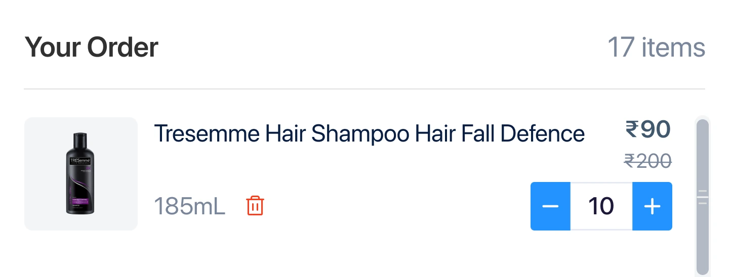
His basket is 20–40 lines
Not three. Every consumer cart pattern I inherited was designed for a basket a tenth of that size, and it showed.
- .03
He is interrupted constantly
He orders between customers, one-handed, mid-shift. Any flow that needs two uninterrupted minutes gets abandoned.
Thread 01 · Catalogue & offers
The promotions were eating the catalogue.
On the listing screen every product carried its schemes as stacked full-width rows underneath it: “Get additional 3% off per unit”, “Get Flat Rs.50 OFF on Bill of Rs.500”. Two schemes roughly doubled the height of a product card. Merchandising adds schemes weekly, so the layout got worse over time and no designer was in that loop.
The effect on a 360px screen: a retailer scanning for one SKU saw barely two products at a time, and most of what he scrolled past was promotional copy rather than products. The offers were not helping him decide. They were standing between him and the decision.
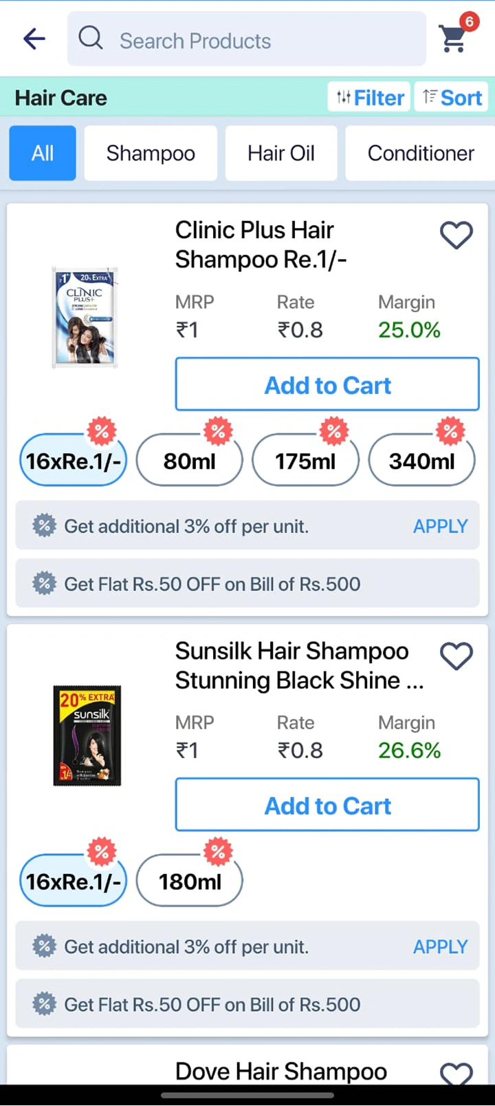
Before
Two schemes per product, stacked full width. Card height varies with promotion count.
25%
shorter card pitch, so more catalogue per screen
After
Schemes collapsed into one horizontal row. Card height is now constant at 231 px.
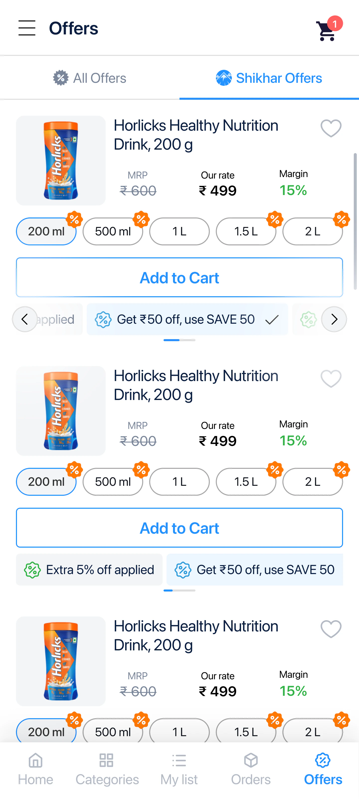
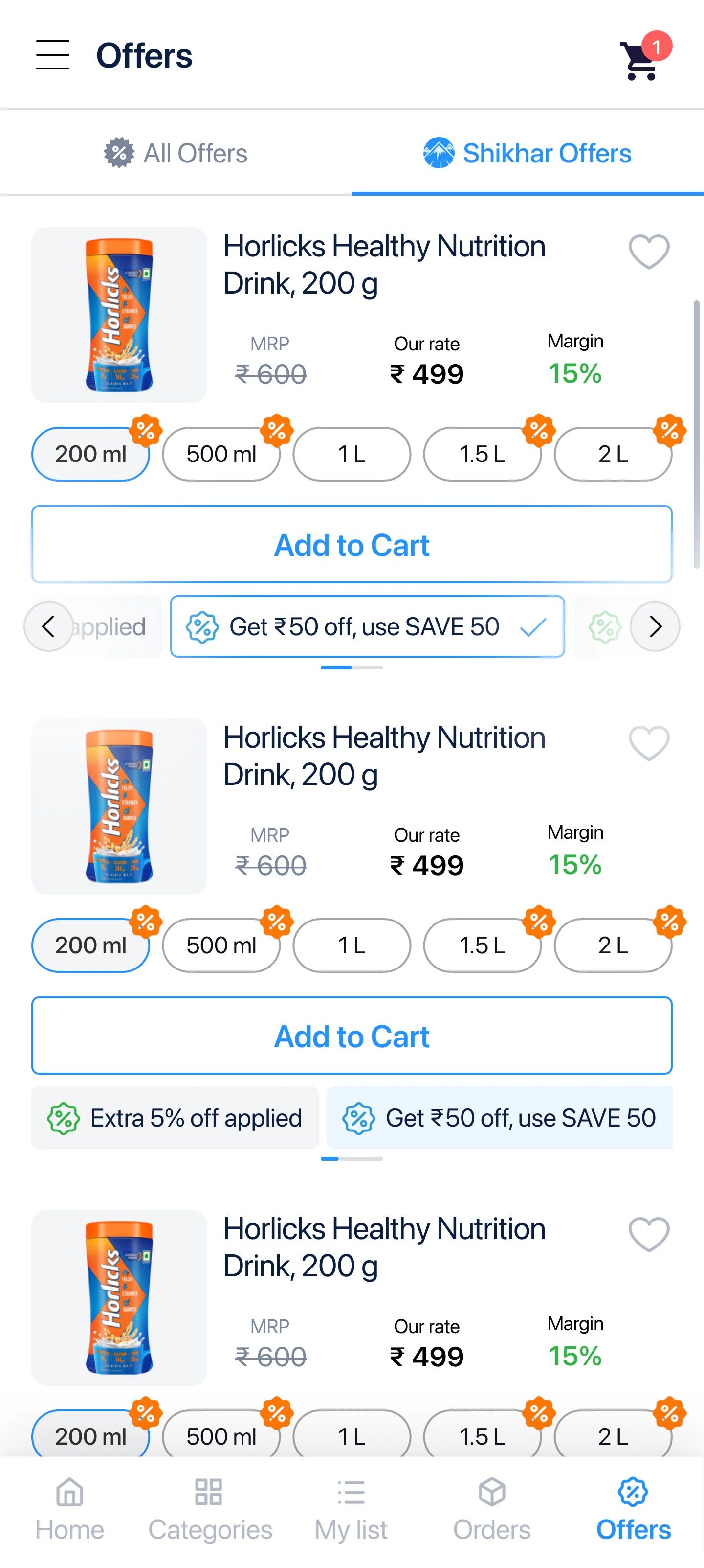
Schemes collapsed into one horizontal row. Card height is now constant.
The decision
Make the card height independent of how many schemes a product carries.
Offers move into a single horizontal carousel inside the card. One row, fixed height, whether the SKU has one scheme or five. The generic “APPLY” link becomes a selectable chip with a tick, because a retailer stacking three schemes needs to see which ones he has already taken, not re-read the terms each time.
The property I actually cared about: merchandising can now add promotions without changing the layout. That removes a recurring design dependency, which is the same problem I was solving on the campaign dashboard side of this account.
Thread 02 · Cart
A cart built for three items, holding forty.
The cart used the pattern every shopping app uses: one long vertical list of line items, with everything else stacked below it. That works when the basket is three products. A kirana restock is thirty.
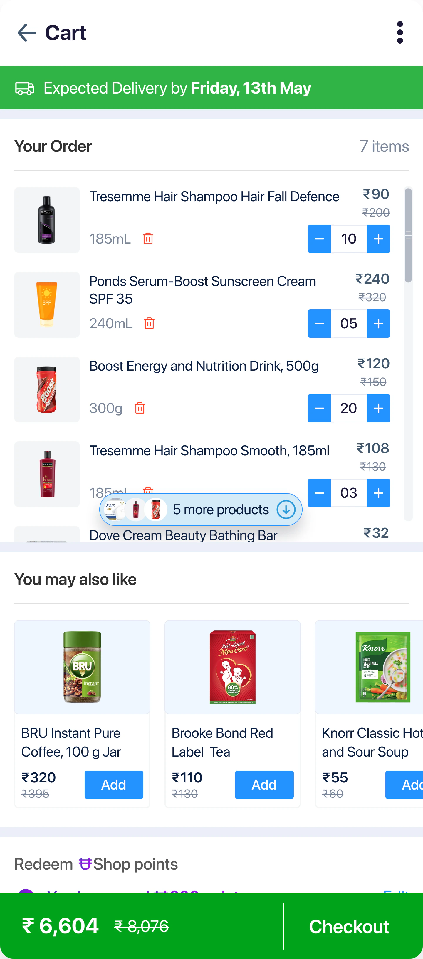
At that size, everything the retailer actually needs before paying (his redeemable points, the bill breakdown, the total) sat several thousand pixels down the page. Functionally they did not exist. He was being asked to scroll past his own order to find out what it cost.
- .01
The order list scrolls inside itself
A fixed-height region holds the line items. The page below it stays short and reachable, no matter how many products are in the basket.
- .02
A count, not just a gradient
A floating “5 more products ↓” pill sits over the bottom edge. A scroll region nested in a scrolling page is easy to miss entirely. The pill announces it and says how much is left.
- .03
Points surface in the first fold
Because the list no longer runs the length of the page, the retailer can see unspent Shop points before he pays rather than after. Previously that was unreachable without deliberate scrolling.
- .04
Suggestions placed after commitment
“You may also like” sits below the order, not inside the catalogue. The cart is the one screen where he has already decided and is reviewing: the right moment to offer an adjacent SKU. The wrong one is mid-search.
Thread 03 · Order summary
For this buyer, the bill is the product.
A retailer’s question at checkout is not “what does this cost”. It is “what do I make on this, and what did I actually save”. That information already existed in the system (retailer margin, scheme discounts, platform discounts, points earned) but it arrived as a single number with no working shown.
So the summary became an expandable ledger: total MRP, items total, retailer margin, scheme discount with a count of how many offers fired, Shikhar discount, total savings, total payable, points earned.
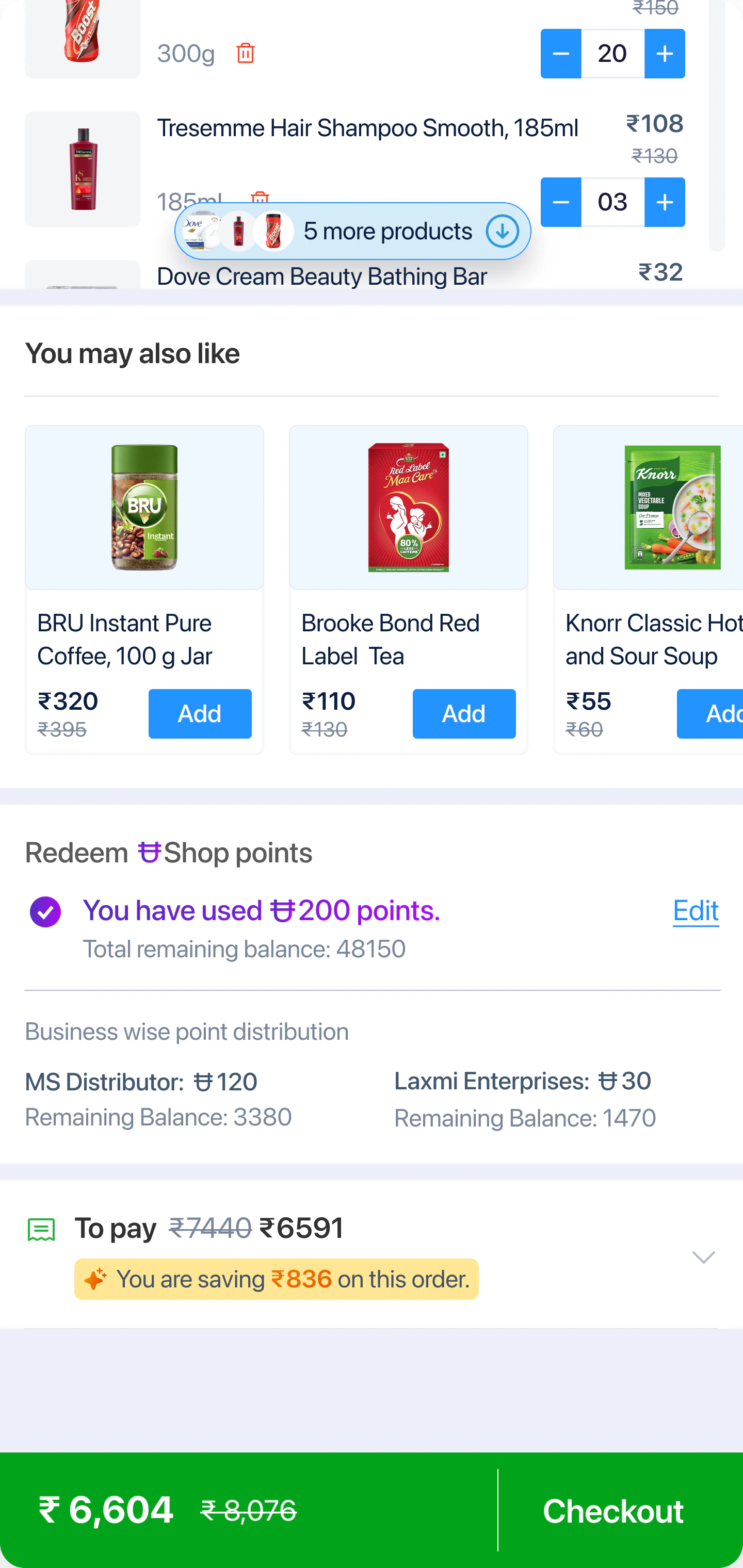
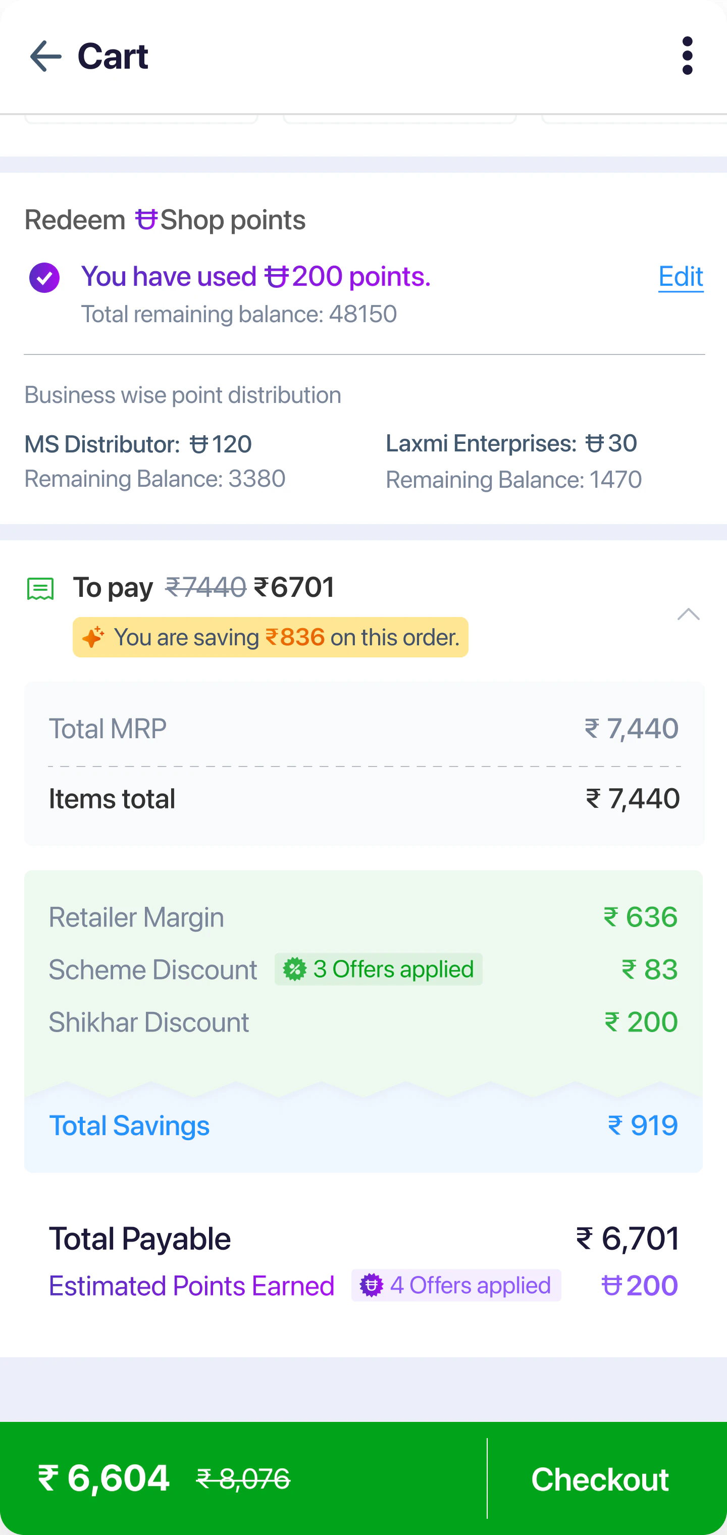
Points and payable visible without expanding. Per-distributor balances sit directly under the redemption row.
Order summary
7 items · 2 distributors
- Total MRP
- ₹7,440
- Items total
- ₹7,440
- Retailer margin
- ₹636
- Scheme discount(3 offers applied)
- ₹83
- Shikhar discount
- ₹200
- Total savings
- ₹919
- Total payable
- ₹6,701
- Points earned(4 offers applied)
- 200
You are saving ₹836 on this order
Why expandable
Collapsed by default, because the routine reorder should stay fast. Expandable, because the retailer who wants to audit the arithmetic really wants to audit it. If the app will not show him, he will rebuild it on paper.
The detail I’d defend hardest
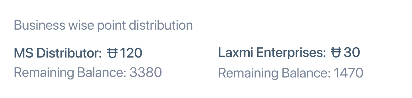
Loyalty points are shown per distributor, not pooled.
A kirana owner buys through more than one distributor, and his points balance is held separately with each of them. A single pooled figure would have been cleaner, calmer, and wrong: he would have tried to redeem against a distributor where the balance was not there, and discovered it at payment.
So the sheet splits it: MS Distributor and Laxmi Enterprises, each with points used and balance remaining. It is a denser row than I would have liked. It is also the row that keeps the number trustworthy, and in a margin-driven purchase, trust in the number is the whole thing.
Thread 04 · Assisted ordering
The interface was competing with a phone call, and losing.
A real share of retailers were not ordering in the app at all. Some were not comfortable with it. Many more were simply too busy to assemble a thirty-line order on a phone between customers. Their fallback was to call the distributor’s sales rep, who knew the catalogue and could take the order in a minute of speech.
The tempting fix was to make the app easier until the call stopped happening. I did not believe that would work. The call is faster than any interface, forgiving of a half-remembered SKU, and happens in the retailer’s own language. What the call lacked was a record: an order placed by a rep left the retailer with nothing to check.
So rather than compete with it, I brought the call inside the product and gave it the one thing it was missing.
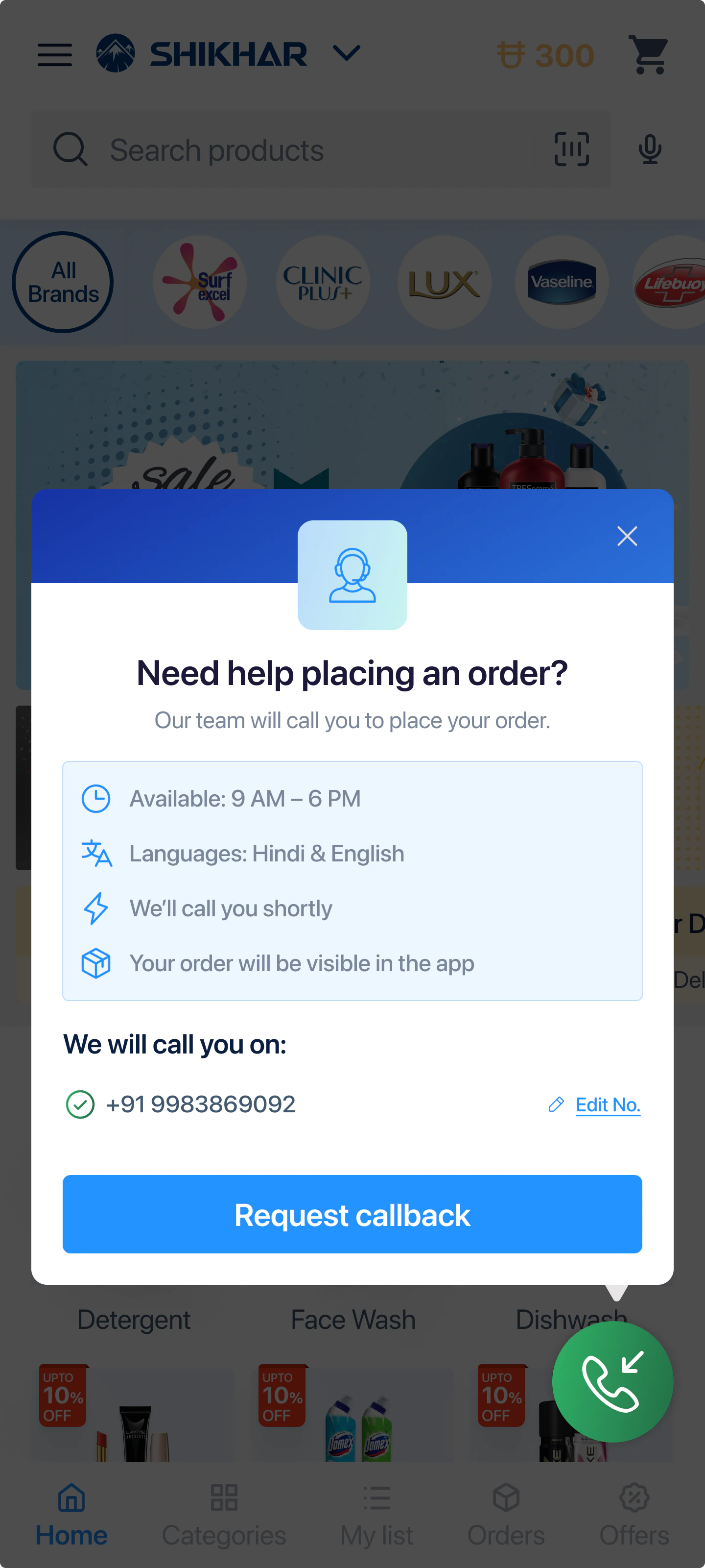
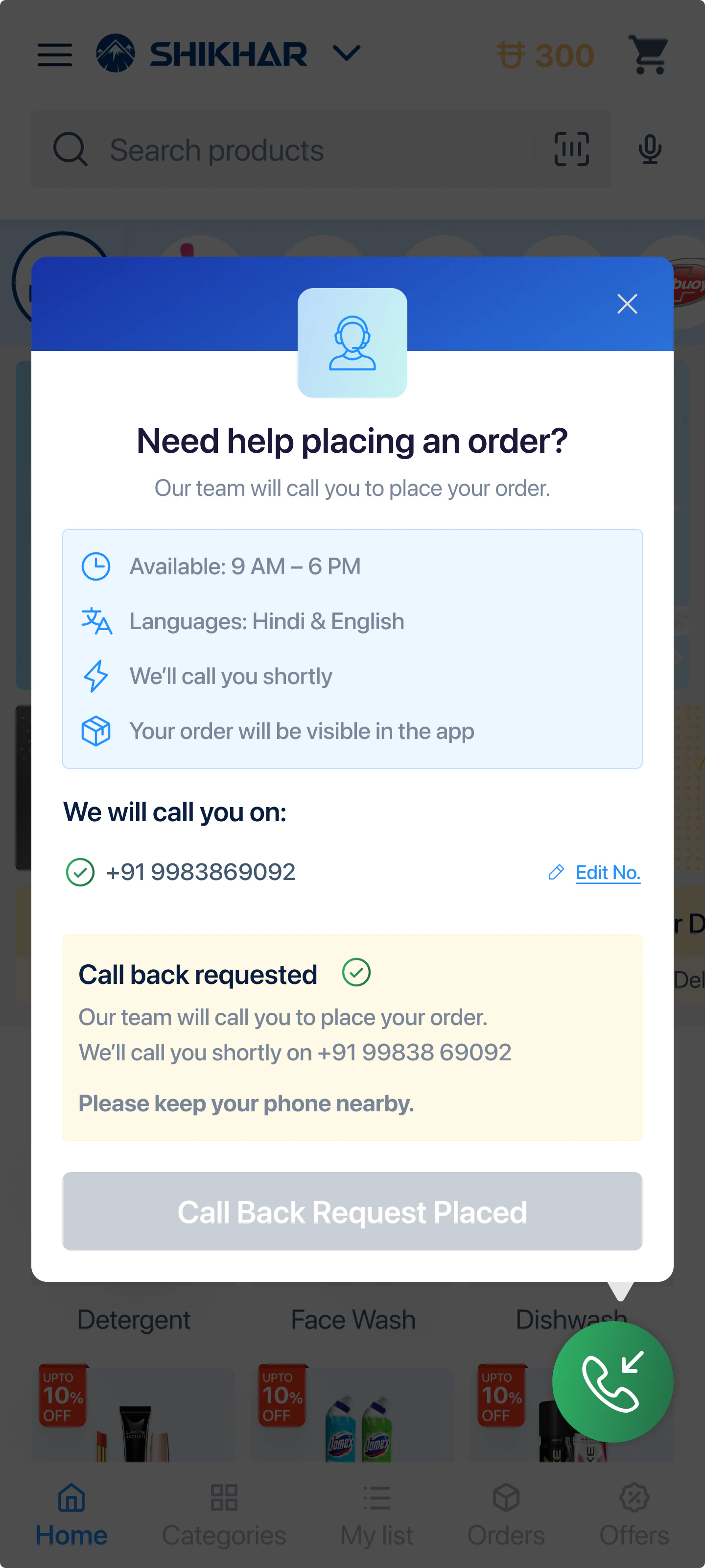
Step 1 of 4, Entry: Shikhar home screen with a persistent green call button in the bottom corner
What is actually in the sheet
Four lines that each remove one reason not to press the button.
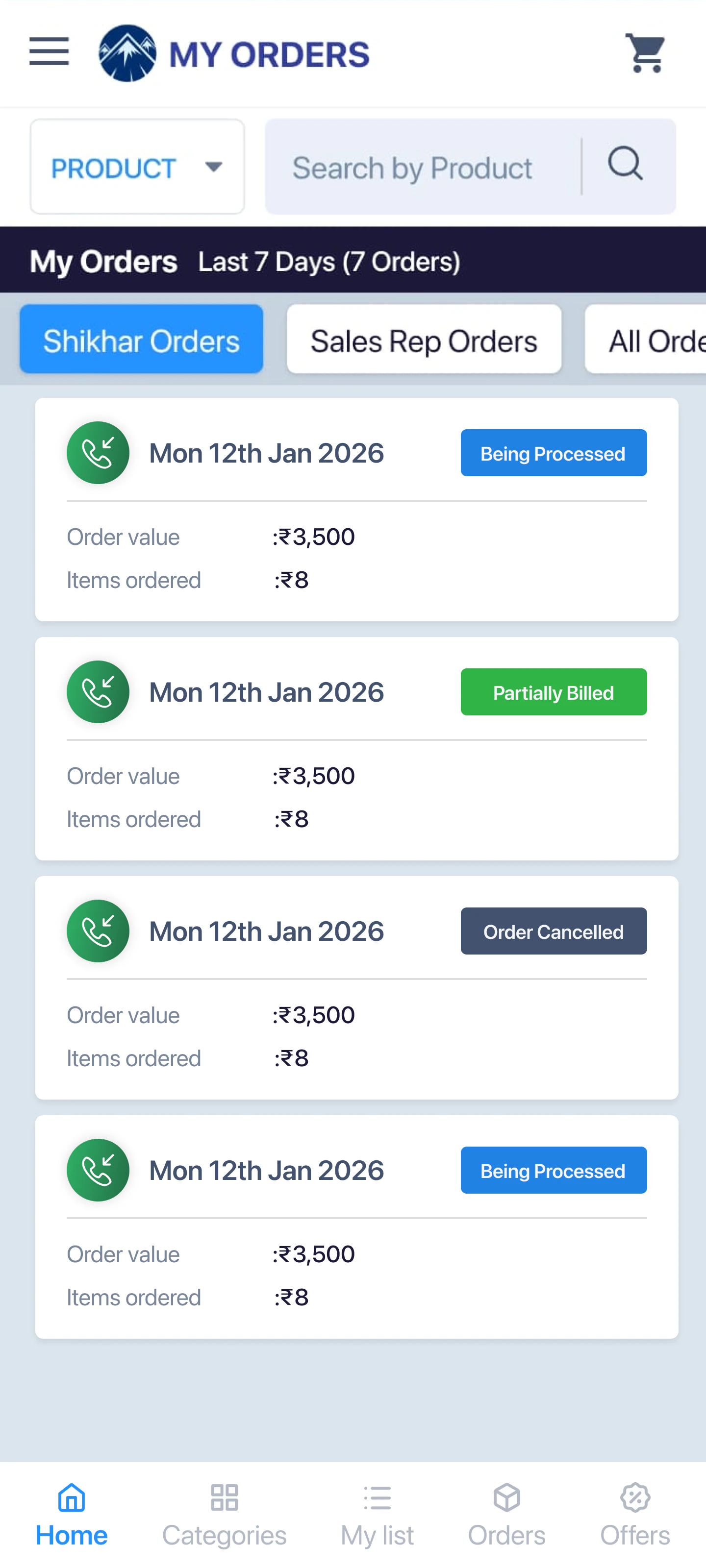
That last line is a promise made on one screen and kept on another. It is why the My Orders screen got a phone marker and a Shikhar / Sales Rep filter, and why I would treat those two screens as a single piece of work rather than two tickets.
So he knows whether to wait or try tomorrow.
Removes the single biggest reason people avoid calling a helpline.
So he is not holding.
The trust clause. Someone else is about to place an order on his account, and he needs to know he can check it afterwards.
Interlude · Seasonal identity
The icon changes for Holi.
A festival variant of the app icon: a rangoli ring and gulal bowls around the existing mountain mark.
This is the smallest piece of work in the project and one of the few that touches the retailer before he opens anything. The icon sits on a home screen next to WhatsApp and a payments app, in a business relationship that is otherwise entirely transactional: stock in, margin out.
Marking the festival is the cheapest affinity gesture available to a supply-chain product, and it is legible at 60px without touching the brand mark's geometry. The constraint I set was that the base logo does not change, only what surrounds it, so the variant never competes with recognition.
 On a home screen
Trade-offs
What I chose not to do.
The decisions I argued against are a better description of the work than the ones I shipped.
Didn’t hide margin behind a tap
It is the retailer’s primary decision input, and the most common request from the business was to give that space to promotional messaging. Margin stays on the card at rest.
Didn’t leave the offer carousel on autoplay
Only first-time users see it rotate. Permanent motion sitting two centimetres from a price is a legibility problem, and this is a screen people read numbers off.
Didn’t rebuild the catalogue’s information architecture
It was the obvious big-ticket redesign and it was not where the friction was. The friction was card density and checkout comprehension.
Didn’t build voice ordering
The obvious answer for low digital literacy in India. But a callback to a human who already knows the catalogue was cheaper to build, more reliable with mixed Hindi-English SKU names, and, crucially, already the behaviour retailers had. I would rather formalise an existing habit than train a new one.
Outcomes
What shipped, and what changed.
All four flows were live business requirements, went into development, and shipped. The changes below are structural: you can verify every one of them against the screens above without taking my word for it.
- 01
4 flows, end to end
Catalogue and offers, cart, order summary, and assisted ordering, specified through to development handoff, including empty, applied, confirmed and error states.
- 02
231 px
Fixed product card height, down from a card that grew with every scheme attached to a SKU. Merchandising can now add promotions without the layout degrading.
- 03
25% shorter card pitch
Vertical distance between products fell from roughly 310px to 231px, so more of the catalogue is visible per screen at the same scroll cost.
- 04
Constant, not linear
Scroll depth to reach the bill and points used to grow with every line item added. It is now fixed regardless of whether the basket holds five products or forty.
BeforeAfterDepth to the bill, by line items - 05
2 taps to reach a human
Requesting assisted ordering went from leaving the app to find and dial a rep, to a persistent button and a single confirmation.
- 06
One order history, two sources
Rep-placed and app-placed orders now land in the same list with a source filter, so an order placed on the retailer’s behalf is auditable by him.
What I’d hold it to
Three numbers would settle whether the structural wins became behavioural ones.
Products viewed per catalogue session, points-redemption rate at checkout, and cart abandonment above twenty line items. The last is the one I’d watch hardest: the entire cart argument rests on large baskets failing, and that is where it would show.
What I took from it
In consumer products the interface competes with another interface. In B2B it usually competes with a phone call.
The phone call is fast, forgiving of a half-remembered name, and conducted in the user’s own language. Anything that loses on those three gets routed around, and no amount of visual polish changes that. The parts of this project I am most confident about are the ones that either beat the call on its own terms (density, arithmetic you can check) or stopped trying to and absorbed it instead.
All interface data shown is placeholder, used to demonstrate the design. Some details simplified for confidentiality.
Next case study
Steer: the design system behind Readywire's showroom floor
Read it
Facing a similar problem?
Start a project